How to Master Jewelry Design: Tools, Techniques & Tips for Stunning Creations
Essential Tools, Techniques, and Tips for Creating Jewelry Art
はじめに
This comprehensive guide delves into the art of hand-drawing jewelry, covering essential tools, structural perspectives, and the nuances of composition, color, and material expression. It begins by introducing a variety of tools crucial for jewelry painting, such as pencils, erasers, templates, paints, and brushes, explaining their uses and the effects they produce. The guide then explores the principles of perspective, crucial for depicting the three-dimensional nature of jewelry on a two-dimensional surface. It discusses one-point, two-point, and three-point perspectives, providing insights into how different viewpoints affect the visual representation of jewelry.
In the composition section, the guide outlines basic rules that help artists create balanced and aesthetically pleasing designs, emphasizing the importance of aspect ratios, symmetry, balance, and the interplay between positive and negative space. The final section focuses on color and material expression, teaching artists how to use color theory to represent different materials accurately, including metals, gemstones, and pearls. It provides detailed techniques for depicting the unique luster and transparency of these materials, ensuring that the artwork captures the true essence of the jewelry piece. This guide is an invaluable resource for jewelry designers, artists, and enthusiasts looking to enhance their hand-drawing skills and create vivid, lifelike jewelry illustrations.

水彩絵の具
目次
Section I Commonly Used Tools for Hand-Drawing Expression
1. Pencil

2. Pencil Sharpener

3. Eraser

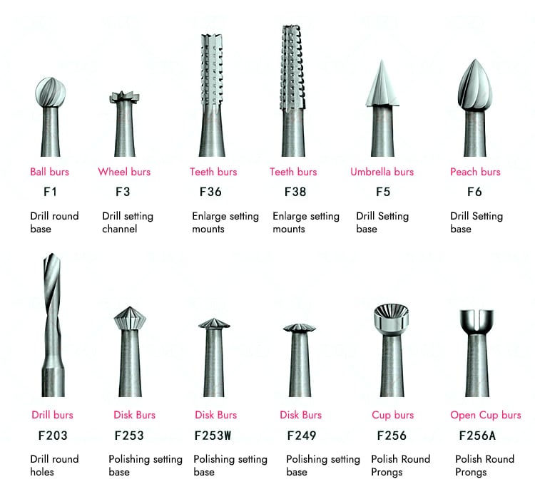
4. Jewelry Template

5. Paint

水彩絵の具

Gouache paint
6. Colored Pencils

7. Writing Brush

8. Triangle Ruler

9. French Curve

10. Vernier Caliper

11. Tracing Paper

12. Cardboard
Cardboard is divided into different types, such as white cards, gray cards, black cards, and colored cards. The three colors of white, gray, and black are relatively simple, which allows them to better highlight the brilliant luster of various ornaments. Therefore, these three types of cardboard are widely used in jewelry painting. Gems and metals generally have a very bright luster, and when painting, it is often necessary to use white highlights to represent their reflections. The color of white cards often conflicts with the highlighting effect, so materials with higher brightness generally do not use white cards for painting. The black card has a subdued base color, but whether using watercolor or gouache, some light colors, such as bright yellow, light green, and orange, do not have sufficient coverage on black cards and can easily be overwhelmed by the base color. Therefore, when painting on a black card, one must carefully analyze the colors of the materials to be represented and choose cautiously. In comparison, a gray card is the most commonly used paper in jewelry painting, as its natural color is right in the middle of the brightness scale, allowing both dark and light colors to be well supported. However, it is important to note that most gray cards are relatively soft, and the colors painted on gray cards may have some color difference before and after the paint dries. Therefore, artists must test colors on the same type of paper before painting the final piece.
When painting jewelry, the artist needs to consider the actual effects of different materials and use them accordingly. For textured paper, colored pencil techniques can be tried; for smoother paper surfaces, watercolor and gouache can achieve good results; transparent diamonds are difficult to portray with white cardstock, but gray or black cardstock can highlight them perfectly… They can achieve the desired effects only when the artist is familiar with using techniques and expressing characteristics of different painting tools, and one can better master them and convey their design concepts.

White cardboard

Various colors of gray cardboard

Section II Structure and Perspective
1. Structural Expression
1.1 The Basic Principles of Perspective
Jewelry is a three-dimensional object possessing a certain height, width, and length, occupying a specific space, and presenting different visual forms when observed from different angles. This requires the painter to first have a three-dimensional concept in mind. Although the effect drawings of jewelry are two-dimensional and flat, we must express three-dimensional space and volume on flat paper. Furthermore, the painter must have a holistic view, as a piece of jewelry may be composed of multiple parts made of different materials and shapes, with different parts having a certain proportion, collectively forming an overall relationship. Learning to paint jewelry requires the ability to move from the whole to the part, from the outline to the details, delving deeper layer by layer while grasping the structure to express the ornament’s color, texture, and volume relationships.
To better represent jewelry, it is necessary to paint from different angles, as different visual perspectives will produce different changes. Therefore, we need to understand the basic knowledge of perspective. The intuitive image of perspective in our daily life is the phenomenon of perspective; for example, when we stand in the middle of a tree-lined avenue and look into the distance, the parallel trees on both sides seem to disappear into a single point; a photograph can also produce the same phenomenon when photographing along the depth of the street from the center of the street. The perspective method, also known as the method of distance, was famously studied by the Italian Renaissance painter Da Vinci and the German painter Dürer. The typical perspective method is based on the distance of objects, creating a sense of depth. Various changes arise from the movement of the viewpoint, leading to different perspective methods. The basic terms involved in perspective include:
(1) Horizon line: A horizontal line parallel to the artist’s eyes.
(2) Focal point: The artist’s eyes directly face a point on the horizon line.
(3) Viewpoint: The position of the artist’s eyes.
(4) Visual midline: A line that connects the viewpoint and the focal point, forming a right angle with the horizon line.
(5) Vanishing point: The vanishing points on either side of the horizon line where objects at an angle to the picture plane recede in perspective.
(6) Parallel perspective: The perspective of a square or rectangular object parallel to the picture plane. This perspective has a neat, flat, stable, and solemn feeling.
(7) Angular perspective: The perspective of a square or rectangular object whose sides are not parallel to the picture plane. This perspective can make the composition more varied.

1.2 Commonly used Principles of Perspective Drawing


1.3 The Representation of Circular Structures and the Principles of Perspective
1.4 The Connection and Perspective Changes of Different Gemstones


The trillion cut gemstone is based on a triangle, usually with the corners truncated, displaying a varied facet design. When viewed from the perspective of the trillion-cut gemstone, the small bottom facet is usually seen in the middle of the table, showing a uniform gemstone pavilion. The girdle is generally parallel to the table when observed from the side. The main facets of the pavilion usually extend from the small vertical bottom facet to the intersection of the facets and the girdle. Due to the equal sides, the triangular cut can reflect most of the light and color.
Pear-shaped cutting is a mixed-cutting method that combines the advantages of oval cutting and marquise cutting, resulting in a gem shape that resembles a sparkling teardrop. Pear-shaped cuts typically have good depth, with a length-to-width ratio 1.5:1, to achieve an excellent appearance. In terms of rings, this cut enhances the beauty of small and long fingers. Pear-shaped gems are used in pendants and earrings, making them even more attractive.


The heart shape symbolizes love, and the length-to-width ratio of heart-shaped cut gemstones is approximately 1.1:1, and the length is slightly larger, but the ratio usually does not exceed 1.2:1. Most heart-shaped cut gemstones are almost round, which allows for a nearly round pavilion capable of producing a beautiful luster.
Fancy cutting is an innovative method, a deformation of standard shapes, to create larger and more perfect gemstones. Some designs revolve around natural stones, while others are filled with fashion. All unusual forms, such as floral and star shapes, may appear in fancy cutting. If the natural texture of the gemstone can be fully combined with later manual carving, the uniqueness of the gemstone can be fully revealed.
In order to better represent the perspective relationships of jewelry, one needs to master the structure of gemstones from different perspective angles. Especially when depicting necklace jewelry, the gemstones located at different positions in the chain structure exhibit different perspective changes in their facets. Many beginners often overlook the structural perspective of gemstones when illustrating necklace structures, making it difficult to convey the three-dimensional effect of the jewelry. The structure of gemstones presents different forms from various visual angles, and after mastering the structure of gemstones, one should also be familiar with the perspective changes of various gemstones.

Structure of other shape cutting gemstones:

The state of gemstones at different angles
2. The Basic Principle of Three-View
Most jewelry pieces present different appearances when observed from different angles, so it is difficult to capture their entirety by drawing from one angle. This is especially true when design and production are separated; during the later production process, without multi-angle structural breakdown diagrams, it will be challenging for the maker to fully understand the designer’s intentions.
Jewelry is three-dimensional, occupying a certain volume in space, and must be observed from multiple angles such as above, below, left, right, front, and back. The three-view drawing is the best way to represent this relationship.
2.1 The Formation of the Three Views
Since one view of an object cannot express the entire appearance of the object, designers must project from different directions to show the complete aspect of the design work, which means using three views to express the shape of the design work. Generally, objects have three mutually perpendicular directions: length, width, and height. Therefore, we first establish three mutually perpendicular projection planes in space: the front V, horizontal H, and side views W. Taking the common ring shape in jewelry design as an example, it is placed in the space formed by the V, H, and W planes so that its main surfaces are parallel to the three projection surfaces, and then project the cylindrical ring onto the three projection surfaces respectively. In this way, the three views of the cylindrical ring are obtained.
The front view is obtained by projecting the object from the front direction onto the V plane.
The top view is obtained by projecting from above the object onto the H plane.
Left view – the view projected from the object’s left side onto the W plane.


2.2 The Projection Relationship between the Front and Side Views
From the three views of the annular body, we can see that each can only represent the shape and size in two directions. For example, the front view reflects the length and height of the annular body, the left view reflects its width and height, and the top view reflects its length and width. According to the relationship of the three views, the projection rules of the three views can be summarized as “length aligned, height level, width consistent.” That is:
(1) The front and top views reflect the object’s length, and the lengths are aligned.
(2) The front and left views reflect the object’s height, and the heights are aligned.
(3) The top and left views reflect the object’s width, which is consistent.
This rule applies not only to the whole object but also to every part of the object or any point. If you want to draw the bottom view of a design work, just like the top view, it also reflects the length and width of the object, and the principle of consistent width must also be followed.
コピーライト @ Sobling.Jewelry - ジュエリー カスタムジュエリーメーカー、OEMおよびODMジュエリー工場
2.3 The Three Views Reflect the Positional Relationship of the Object
The object has six directional positional relationships: up, down, left, right, front, and back. Each view can only reflect the positional relationships of four directions. The front view reflects the relative positions of up, down, left, and right; the top view reflects the relative positions of the left, right, front, and back; the left view reflects the relative positions of up, down, front, and back. These relationships are summarized as follows:
(1) The front view and the left view are arranged vertically.
(2) The front and top views show left and right.
(3) The top and left views are determined in the front and back.
The view of the object drawn according to the orthographic projection method is to depict each surface and contour line that makes up the object with drawing lines. Visible contours are drawn with solid, thick lines, while invisible contours are drawn with dashed lines. Therefore, the lines on the object’s surface correspond to the drawing lines and outlines in the view.

2.4 The Meaning of the Outline

2.5 General Drawing Method for Three Views of Jewelry
Drawing the three views of jewelry requires a high level of spatial thinking ability from the artist. When designing jewelry, it is important to consider the angles from which the piece will be displayed when worn. The general steps for drawing the three views based on the basic principles of perspective are as follows:
(1) Once the necessary information is mastered, one can proceed to the drawing stage of modeling design. This stage also has a certain process and steps. First is the sketch stage, where the appearance relationships from various angles are considered, and then the three-view drawing is created. When drawing the three views, the front view, top view, and left view should be drawn together, completing them simultaneously according to the projection rules between the three views.
(2) Choose the direction with the most prominent characteristics of the shape as the projection direction of the main view. Use dotted lines and fine solid lines to draw the reference lines for each view.
(3) Use solid lines and dashed lines to draw the three views of the object’s various components in the order of first large and then small, first overall and then partial.
(4) After completing the draft drawing, it is necessary to check for errors, make corrections, and then clean the surface, deepening the lines according to the requirements.
(5) If some designs are relatively complex, a single three-view cannot express the full picture of the design, and an additional bottom view is required.
Only after completing the three-view drawings can one proceed to the rendering and physical samples stages. Once the design concept is formed, it is necessary to seek opinions from stakeholders, such as commissioned designers, customers, managers, salespeople, etc., to improve the design, finalize the design plan, and create production drawings.
Section III Composition, Color and Material Expression
1. The Rules of Composition
1.1 The Concept of Composition
Composition is a term in the visual arts that refers to the organization and arrangement of the images the artist wants to express within a certain spatial range to convey the work’s ideological connotation and aesthetic effect. It creates a specific structure and form between the parts and the whole of the image, as well as between the spaces of the images, forming the overall art. In simple terms, composition is the formal structure of visual arts, encompassing the totality of all modeling factors and means.
Good composition not only better expresses the connotation of the work but also has a good guiding effect on the viewer’s line of sight. The composition of jewelry painting has certain rules and principles that need to be constantly explored and summarized in painting. Mastering the basic rules and techniques of composition is extremely beneficial for the painting and design of jewelry.
1.2 Basic Rules of Composition in Jewelry Design Drawing
The principles of formal beauty are general principles of aesthetics and are equally applicable in the expression of jewelry painting. When composing, the following points should generally be noted:
(1) The Aspect Ratio of the Picture
In the effect drawings of jewelry, the aspect ratio of the composition should be arranged according to the type of subject to be expressed. Generally speaking, vertical compositions give a sense of elongation and are used more frequently in jewelry painting; horizontal compositions provide a sense of stability and calmness, and can be used for the composition design of images with a wide variety of accessories, resulting in a more cohesive overall effect.

(2) Arrangement of the Size and Position of the Main Subject in the Painting
According to the paper’s size, the ratio of the main jewelry to be depicted needs to be set. If it is too large, the picture will feel too full and create a sense of oppression; if it is too small, the excess white space on the paper will make the picture appear thin. Therefore, the main subject should be of moderate size. Generally, the center position of the picture gives a very stable feeling. If the main subject is arranged in the center of the picture, it will lack a sense of liveliness in visual perception. Therefore, a composition layout that is tight at the top and loose at the bottom, which has a certain sense of movement, is a better choice.
(3) Symmetry and Balance
Balance is the other side of unity and moderate change, and it is the principle for maintaining the uniform appearance of objects. There are two forms of maintaining balance: symmetry and equilibrium. Symmetry is uniformity. The balance of composition refers to the layout of the composition that gives a visual sense of a balanced state of force or a sense of visual stability, manifested in the rationality and uniformity of the composition layout.
Since the human body wearing jewelry is in a state of left-right symmetry, jewelry is generally designed in a symmetrical style. However, excessive symmetry can sometimes create a mechanical and rigid visual effect. When composing, one can avoid absolute symmetry; create a sense of movement through variations in the arrangement of some accessories.
Jewelry is often designed in sets, such as a series design of necklaces and rings, bracelets and earrings, etc. When painting a series of jewelry, the composition does not need to deliberately pursue a sense of symmetry; if the image does not have a noticeable sense of weightlessness and can create a sense of stability visually, appropriate asymmetry can make the composition appear more lively.
(4) Dominance and Subordination, Positive and Negative Space
The relationship between dominance and subordination elements and the interplay of positive and negative space runs throughout the jewelry painting. If there is a focus in the composition, there must be non-focus; if there is a main subject, there must be a secondary subject. From the beginning of the composition in jewelry painting, one should consider what constitutes the main and secondary subjects. Multiple focal points often imply a lack of focus; for example, a necklace often has multiple links with the same structural form. If each link is meticulously depicted, it not only takes a lot of time and effort but also tends to create a flat and rigid appearance. However, suppose the pendant is the focal point of the depiction, with the repeated links on both sides gradually appearing weaker. In that case, it creates a composition with clear dominant and subordinate elements and a balance of positive and negative space.

The composition is calm and centered.

This series of designs includes necklaces, rings, pendants, and bracelets. Generally speaking, laying out the same picture with various ornaments is difficult. In this design, the three smaller ornaments and the relatively larger necklace are distributed on both sides of the picture, which does not achieve a balanced posture. Still, there is no obvious sense of weightlessness, which is a desirable way of composition.

It is important to pay attention to handling the relationship between primary and secondary and the relationship between reality and reality in the picture.
2. Expression of Color
2.1 Basic Theory of Color
Light is the reason for the production of color; color is the result of light waves being perceived, which is the visual sensation of red, orange, yellow, purple, black, white, bright, gray, and similar colors produced by the human eye under visible light stimulation. Anyone with normal visual function can see light waves of different wavelengths, or in other words, colors. The characteristics of jewelry color can be analyzed from three aspects: hue, brightness, and purity, which are referred to as the three elements of color.
(1) 色相
Hue refers to the appearance of colors, such as red, orange, yellow, green, cyan, blue, and purple, and the differences between them are called “hue differences.” The three colors with the highest contrast on the color wheel are red and green, yellow and purple, and blue and orange.
(2) 明るさ
Lightness refers to the brightness level of color, also known as “brightness” or “depth,” with ten levels ranging from black (or dark colors) to white. Levels 1-3 are low lightness, 4-7 are medium lightness, and 8-10 are high lightness. Once white is added to a pure color, the brightness increases; adding black decreases the brightness. Among pure colors, lemon yellow has the highest brightness, while blue and purple have the lowest brightness.
(3) Purity
Purity refers to the degree of color purity, known as “grayness” or “vividness.” If we divide the range from gray to pure bright colors into ten equal intervals, typically 1-3 is the low purity range, 4-7 is the medium purity range and 8-10 is the high purity range. Once gray or other colors are added to a pure color, its purity will inevitably decrease.

2.2 The Textural Techniques of Colored Light in the Coloration of Jewelry Rooms
Jewelry is often made from a combination of different materials, and the reflection, absorption, and transmission of light by these materials vary, which determines their color characteristics. The visual perception of color in jewelry depends on the raw material.
(1) Gold and Silver Materials
Gold, platinum, white gold, and silver are commonly used metals in jewelry design, which inherently have yellow and white hues. They can also display different tones through special smelting, such as reddish and greenish. Metallic materials reflect light, and when painting, the characteristics of these metals need to be expressed through color mixing.
(2) Gemstone Materials
The beautiful colors possessed by gemstones are their most obvious characteristics. Based on the hue and brightness differences of colors, the tones of gemstones range from colorless to black, and gemstones of various hues can be divided into different brightness levels, such as light tone, medium light tone, intermediate tone, medium dark tone, and dark tone. According to processing methods, gemstones can be divided into two main categories: faceted gemstones and cabochon gemstones. The multiple facets of faceted gemstones can refract dazzling light under a light source, while the luster of cabochon gemstones is relatively soft. In addition, there are differences in the transparency of gemstones made from different materials, which are also reflected in their colors.
(3) Pearls
There are many pearl colors, including jade white, silver white, pink, cream, yellow, blue, purplish red, green, and black, with silver, white, and pink being the most common. Due to the nature of natural pearls, the surface of pearls has a special luster, so painting pearls is not only about mastering colors; expressing this special light is key to reflecting the material of the pearl.
The representation of various materials is an important aspect of jewelry painting. In addition to the inherent hue differences of each material, external light sources can also alter their appearance, causing the surface colors of jewelry to exhibit different changes in brightness and purity. These subtle differences make the representation of colors more diverse.
3. Expression of Materials
3.1 Techniques for Expressing Platinum, White Gold, and Silver

(1) Expression Technique One
Use the light and dark relationship of black, white, and gray to express the luster of metal, supplemented by a small amount of pure blue. When painting, avoid excessive blending of colors and focus on expressing the metal’s distinct light and dark transitions.
(2) Expression Techniques Two
Use charcoal sketching combined with paint for expression. First, charcoal will be used to depict the light and shadow relationships of the jewelry, and then the metallic highlights and reflections in appropriate areas will be highlighted in white. This technique is suitable for representation on gray cards, and since pencil strokes have a certain reflectivity, the expressive force is not as strong as that of charcoal.

Charcoal pencil technique for silver.

Charcoal pencil technique for silver

Gouache painting techniques for silver.

Gouache technique for silver.
Summary of Technical Difficulties:
Use black and white to mix platinum, white gold, and silver metallic colors with a regular blue tone; the difficulty lies in the amount of regular blue used. It is recommended that everyone test the colors before painting and only start once the painting effect is confirmed to ensure the desired outcome.
The representation of platinum, white gold, and silver using charcoal sketching combined with paint is relatively simple and easier to master than relying on color mixing to express the texture of metals. The basic focus of sketching is on the dark parts of the object, and the mid-tone positions can utilize the natural color of gray cards. To represent white metals like silver that do not have a strong luster, one can appropriately increase the weight of the sketch, which is very effective in expressing texture.
3.2 Expression Techniques for Gold


Expression Techniques for Gold case 3

Expression Techniques for Gold case 4

Expression Techniques for Gold case 5

Expression Techniques for Gold case 6

This artwork demonstrates the morphological changes of spherical and linear forms, the structure of small parts, and the colors and light-dark relationships that effectively express the texture of gold.

This artwork uses different techniques to express the distinct textures of gold and pearls, with the purple tones in the shadows of the pearls creating a perfect contrast of warm and cool colors with the gold.
Summary of Technical Difficulties:
The key to expressing the material of gold jewelry lies in the purity of color, especially in the dark areas. Adding warm tones, such as those of ochre, can achieve good results. To enhance the contrast between light and dark in metals, some beginners like to use black in the dark areas, which instead makes the color of gold appear obscure. Remember, the use of black should be approached with caution, and since black can easily cause other colors to shift, it is best to avoid mixing black with other colors.
3.3 Techniques for Depicting Gemstones
In nature, there is a wide variety of gemstones. Still, when depicting them in painting, due to the geometric shapes of the flat polished surfaces of various gemstones, it is important to focus on expressing their facet structure and the luster produced by the reflection of those facets. Diamonds are a type of faceted gemstone, and due to their unique luster, this article discusses them separately. In addition to capturing the color of smooth gemstones, attention must also be paid to the expression of luster and transparency.
(1) Techniques for Depicting Diamonds
Diamonds, known as diamonds in mineralogy, are composed of pure carbon above 99.95% and various trace elements. The formation of diamonds can only occur under conditions of approximately 2800 degrees Celsius and a pressure of 1.5 million pounds per square inch, which requires a depth of about 240 miles (386,243 meters) below the Earth’s surface. Afterward, through continuous geological changes and volcanic eruptions, diamond crystals are released to the surface or remain at volcanic vents. Natural diamonds typically form throughout 2.4 to 3.2 billion years, with a minimum age of 60 million, making them the hardest known substance discovered by humans and the purest crystals in nature. The allure of diamonds lies primarily in their possession of optical properties that other natural gemstones do not possess, such as refractive index, dispersion rate, etc. The first impression of a processed diamond is its surface’s dazzling luster and the extremely sharp angles of its facets. When rotating the diamond, orange and blue flashes can be seen on the bottom surface of its pavilion. The color of diamonds can be divided into two main series: one is colorless to light yellow (brown, gray) series, and the other is color series. The color series can be divided into yellow, brown, red, blue, green, pink, etc.
The transparency and luster of diamonds are the focus of painting representation. This chapter mainly discusses the common techniques for depicting transparent diamonds, while painting colored diamonds is similar to the representation methods of other faceted gemstones.

Step 1: Outline the diamond on a black card, flatly apply the dark color, leaving a white edge

Step 2: Distinguish between dark areas and light areas

Step 3: Subdivide each facet

Step 4: Refine the reflection situation of each facet

Step 5: Continue to refine the reflection of each facet

Step 6: Deepen the colors of the brightest facets to highlight the contrast between light and dark and refine the colors and lines of each facet

White metal, a combination of gold and colorless diamonds. The entire design features clever contrasts and smooth lines.

The combination of gold and colorless diamonds.

The combination of white metal and colorless diamonds, gouache.

The combination of white metal and colorless diamonds, gouache.

The combination of colored metals and colorless diamonds.

The combination of gold and colorless diamonds.
Summary of Technical Difficulties:
White paint contains powdery substances and is not easy to apply evenly. When applying the base color, the paint can be mixed to a thinner consistency, and during painting, try to achieve the desired effect in one go. After the paint has dried completely, use a thicker paint to depict the diamond structure. To make the diamond structure appear more solid, using a ruling pen to complete the structural lines is best.
(2) Techniques for Representing Colored Faceted Gemstones
The colors of faceted gemstones are diverse, and unlike diamonds, in addition to the structural representation of the gemstones themselves, their color representation is also very important, especially in avoiding dull colors.


The harmonious unity of color, shape, and material.

The details are exquisite, reflecting the characteristics of various materials.

A combination of various colors and differently sized colored gemstones. The drawbacks are the lack of deep colors, insufficient contrast, and the gemstones do not have a strong luster.

The composition is lively, and the colors are bright.

The overall shape is beautiful, and the color contrast is harmonious, but the only flaw is that the depiction of the necklace is too casual.

The shape is beautiful, and the color contrast is strong yet elegant.


Combination of irregular plain gemstones and diamonds.

Plain gemstone pendants and earrings.
Summary of Technical Difficulties
The key to painting colored faceted gemstones is handling the relationship of color brightness well. Generally, gemstones have a sense of transparency, so dark and dull colors are particularly to be avoided. For the dark areas of the gemstone, deeper colors of the same color family can be used to paint, creating a more harmonious tonal feeling. Using white to highlight the junctions of individual facets will enhance the gemstone’s luster.
(3) The Expression Techniques of Colored Solid Gemstones
The surface of the plain gemstone is smooth, without geometric, flat, polished surfaces, so color and transparency are the keys to its expression. The color must be light and thin, and the white base color easily spreads, so it is best to paint it all at once. Students who are skilled in drawing can also mix a series of colors according to the light and dark relationships of the gemstones themselves without the need for blending and painting directly. Some jade-like materials can also be completed using this painting method. Still, it is important to remember that different materials have varying degrees of luster, which should be appropriately represented in the painting.

The color contrast is striking, the depiction is exquisite, and it effectively showcases the characteristics of various materials and the exquisite quality of the jewelry.

Combination of various colored solid gemstones

The depiction of the gemstones is very well done.
3.4 Techniques for Depicting Pearls
Pearls have been known since ancient times as “the gem of gems.” They are solid granules formed from substances secreted by the outer layer of mollusks and have always attracted attention for their nobility and elegance. Based on their origin, pearls can be divided into natural and cultured. Natural pearls are formed by chance when a foreign object invades the body of a pearl-producing mollusk. The irritation from the foreign object causes the pearl oyster to secrete a smooth substance—nacre—which wraps around the foreign object layer by layer. After several years, the nacre accumulates, eventually forming a lustrous pearl. Due to their rarity and appealing shapes and colors, pearls are used as precious ornaments. Modern jewelry design primarily uses them to create necklaces, bracelets, rings, earrings, and other accessories.
The surface of pearls has a unique luster. Pearls with good luster have an even and moist color and are fine and smooth, making them excellent materials for making jewelry. Pearls come in various colors, which are related to the pigments and elemental composition they contain. For example, pink pearls contain more porphyrin than silver-white pearls, golden pearls have higher amounts of manganese, sodium, and zinc, cream-colored pearls contain more copper, and green pearls have the least metallic elements. The color of pearls can also display a variety of hues due to changes in light source, background, color, and observation angle.
The painting representation of pearls mainly focuses on their color and luster, which can be achieved using colored or charcoal pencils combined with watercolor and gouache. Some bead-like ornaments can also be completed using this painting method, but it is important to distinguish different materials and luster during the painting process.

Pearl necklace.

Pearl brooch.

The combination of plain gemstones and pearls.

The combination of pearls and white metal and the texture of the pearls and the metal is well represented.

The combination of colored plastic and pearls. The color of the pearls is cool.

The combination of pearls and diamonds.

Pearls of different colors

Pearl pendant.

Pearl pendant.

Pearl erring.
Summary of Technical Difficulties:
When painting pearls, appropriate reflections help to express their lustrous sheen, but the colors used for reflections should not be too eye-catching.