How to Master Jewelry Hand-Drawing and Color Techniques?
Mastering Jewelry Design: Tools, Techniques & Color Tips for Stunning Hand-Drawn Creations
Introduction:
Want to learn the basics of hand-drawing jewelry designs? This guide covers everything you need to know. It starts with tools and materials like pencils, markers, and watercolors. Then, it dives into structure and perspective, helping you understand one-point, two-point, and three-point perspectives. You’ll also practice lines and improve your hand-drawing posture. For coloring, it explains the basics of color, including hue, brightness, and purity. Learn marker techniques like horizontal and vertical strokes, and explore watercolor methods such as layering and spattering. Discover how to use colored pencils for flat layering and hatching. Finally, get insights into color matching for stunning jewelry renderings. Perfect for anyone in the jewelry industry looking to enhance their design skills.

Table of Contents
Section I Hand-Drawing Basics
1. Tools and Materials
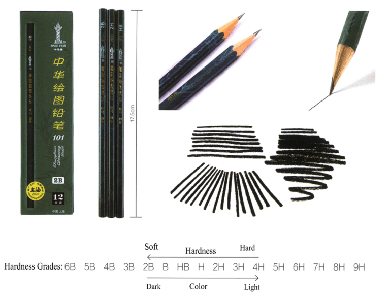
1.1 Drawing Pencil
The hardness of the pencil lead has 13 levels, distinguished by the letters H and B. Among them, H indicates hard, and B indicates soft. The hardness levels range from H1 to H6, with larger numbers indicating stronger hardness and lighter colors; the softness levels range from B1 to B6, with larger numbers indicating greater softness and darker colors. Generally, ordinary pencils are only of HB grade, indicating moderate hardness and softness.
The hand-drawn effect of drawing pencils can vary greatly depending on the hardness of the paper and the pressure applied while drawing, resulting in rich variations of black, white, and gray. The cases in this book mainly use drawing pencils for the initial sketching.
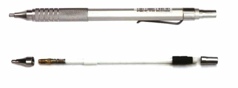
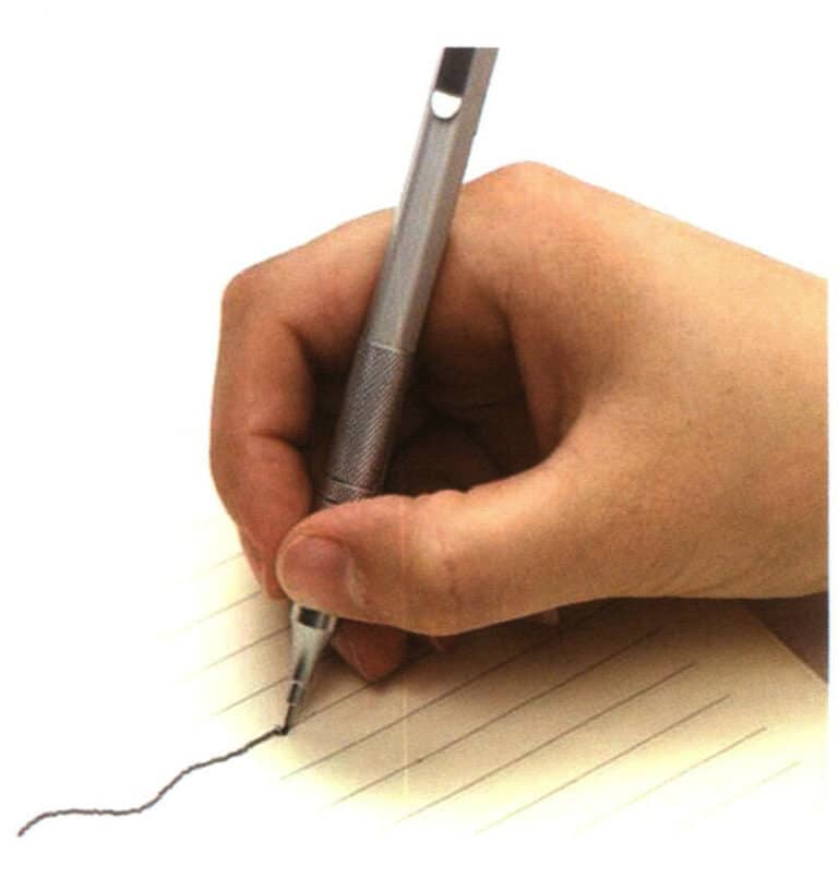
1.2 Mechanical Pencil


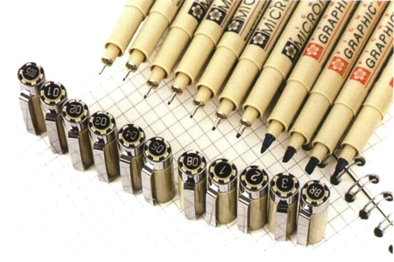
1.3 Technical Pen
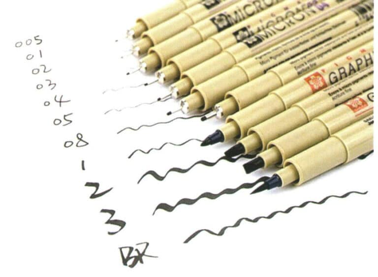

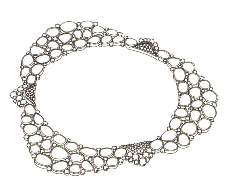
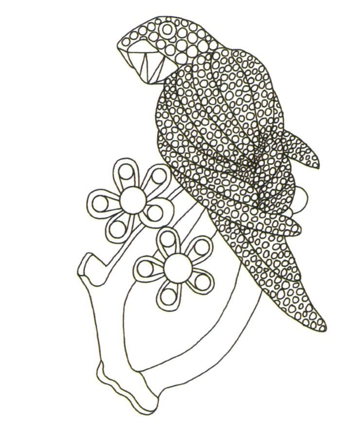
Tips
Beginners just starting with hand drawing must practice a lot, so they do not need to use expensive technical pens. The author recommends using Morning Glory brand conference pens for practice, available in stationery stores everywhere and affordable.
1.4 Marker
Markers are usually used to quickly represent design sketches. They are favored by many designers due to their rich colors, ease of coloring, quick rendering, and portability, especially in creating hand-drawn effect diagrams. However, for jewelry design hand drawing, the drawbacks of markers are also quite obvious, such as the inability to depict details deeply. Therefore, a combined drawing method using markers and colored pencils can be adopted, where markers are used for coloring and colored pencils are used to depict details.
The following will introduce three commonly used types of markers in jewelry design hand-drawing: water-based, oil-based, and alcohol-based.
(1) Water-Based Marker
Water-based markers have bright colors and transparency, but the colors will turn gray after multiple layers and can easily damage the paper surface. If you use a wet brush to apply them on paper, the effect is similar to watercolor.
(2) Oil-Based Marker
Oil-based markers dry quickly, are water-resistant and are excellent at lightfastness. Multiple layers of color can be applied without damaging the paper. Common brands include the Korean Touch oil-based markers, the American Sanfu oil-based markers, and the high-end American AD markers.
(3) Alcohol-Based Marker
Alcohol-based markers can be used on any smooth surface. They are characterized by fast drying time, water resistance, and environmental friendliness, making them widely used in design fields such as wedding venues.
The author recommends using the cost-effective Touch Generation 3 markers during extensive practice, as they are widely available in the market and easy to purchase.
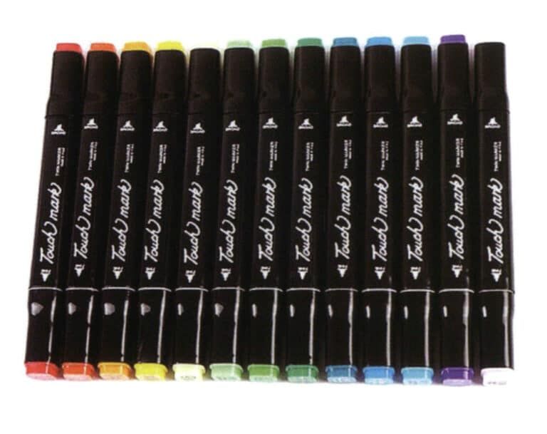
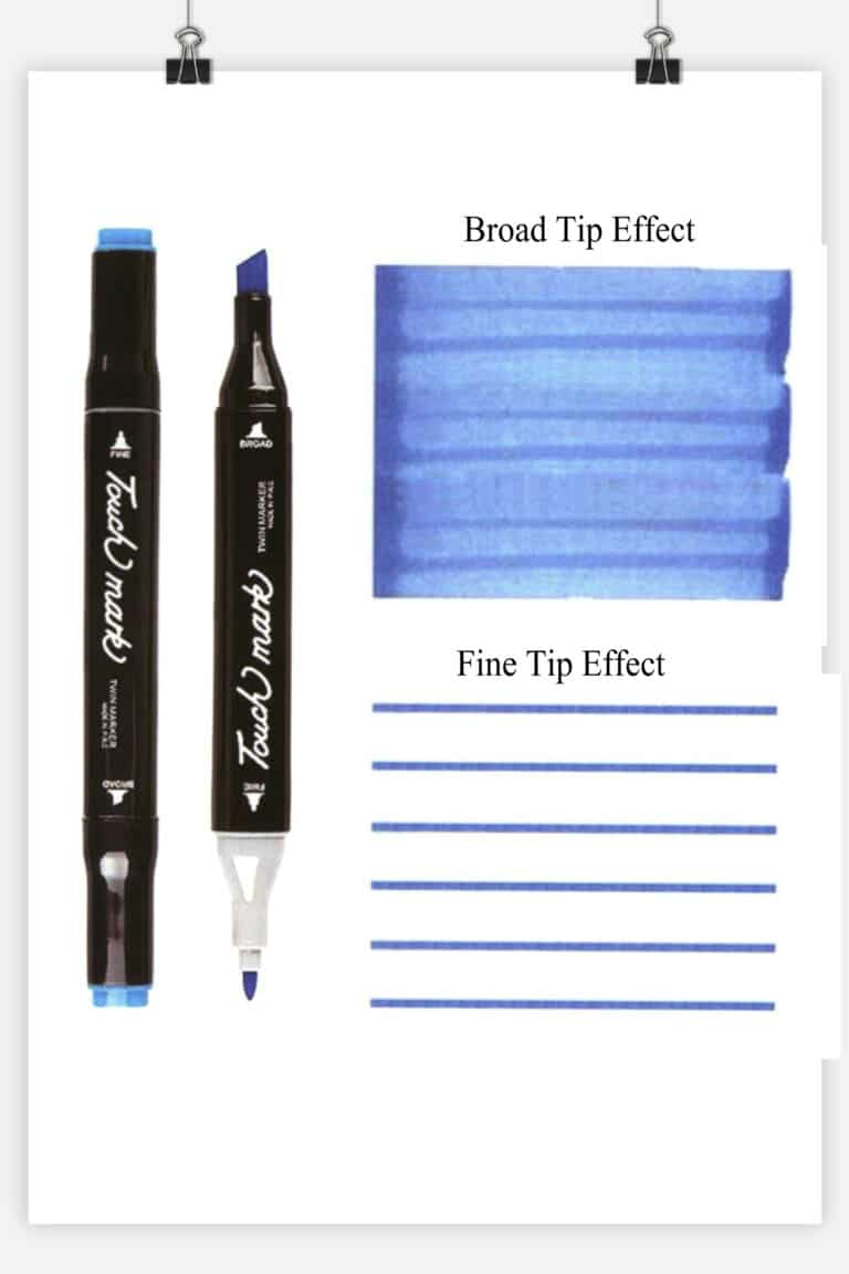
Tips
Because it is an alcohol-based marker, it is prone to evaporation, which can result in the marker running out of “ink.” In this case, simply injecting some alcohol into the tip of the marker will make it usable again.
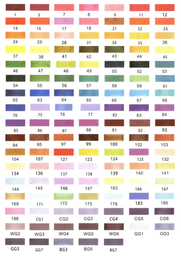
This book mainly analyzes color cards, brush strokes, color usage rules, and color transitions using the Touch 3rd generation markers as an example. The Touch markers distinguish different color numbers with digits, such as and 7, 8, 9, 12, 14, and gray generally has 5 series, with the most commonly used being 3 series: CG (neutral gray series), WG (warm gray series), and BG (cool gray series). CG and BG form their systems of gray.
Here, a relatively cost-effective Touch 3rd generation marker has been selected to create a color card with 117 colors for readers to understand and reference.
1.5 Colored Pencil
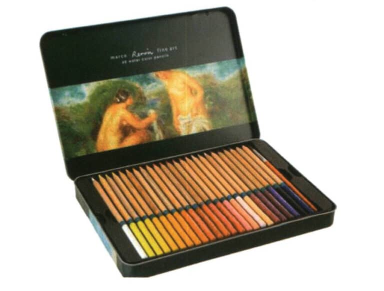
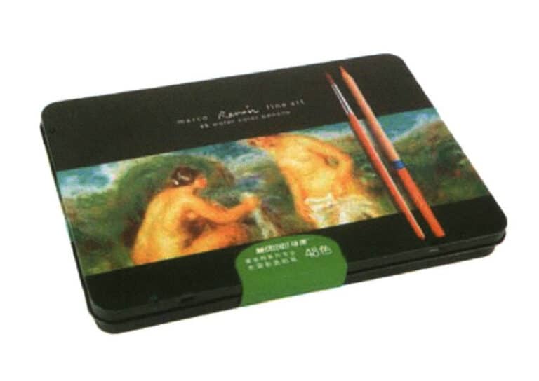
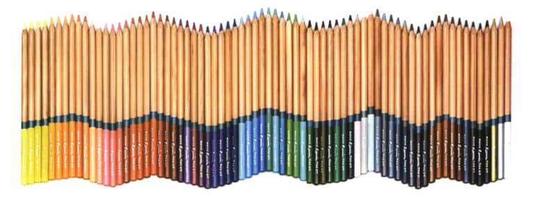
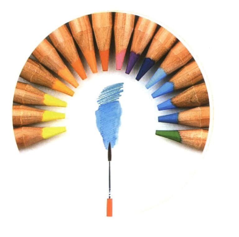
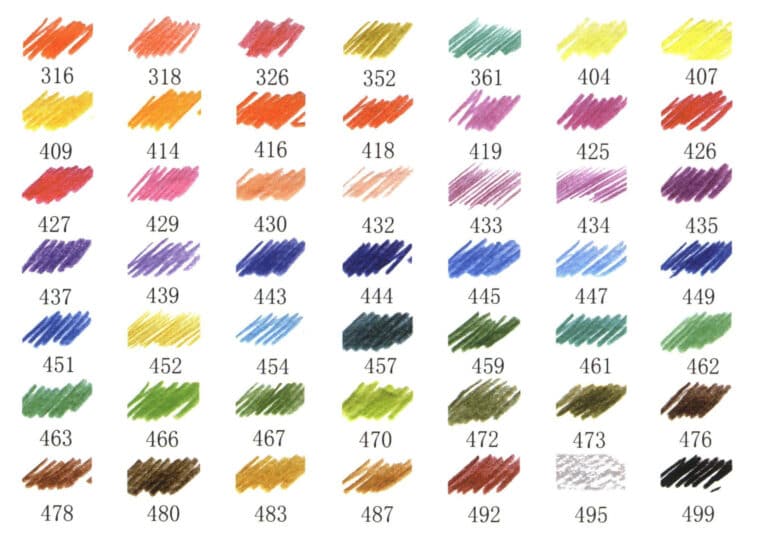
Colored pencils (commonly known as colored leads) are often used alongside transparent watercolors, gouache, and markers, adding more expressive charm to the artwork.
There are many colored pencils, mainly divided into water-soluble and non-water-soluble types. Generally speaking, water-soluble colored pencils contain less wax, have a fine texture, and can create rich layers by overlapping colors.
The colors of colored pencils are diverse, and the effects produced are relatively light, fresh, and simple, making them easy to erase. The colors have a transparent characteristic, and layering one pencil’s tone over another can produce new tonal effects when drawing. Additionally, colored pencils are easy to control, not prone to smudging, and are convenient to carry and store after processing. However, domestic pencils tend to be harder, and the leads can break easily, so it is important to master the appropriate pressure while drawing.
Tips
When applying dark colors, the pressure must be controlled well. Blend from the inside out in the shadow area near the light source, transitioning from dark to light. If a light color layer has been applied beforehand, use a lighter touch to blend to the appropriate color. Before applying color, clarify the contour relationships of each part.
1.6 Graphics Tablet
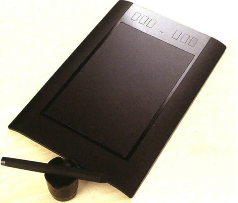
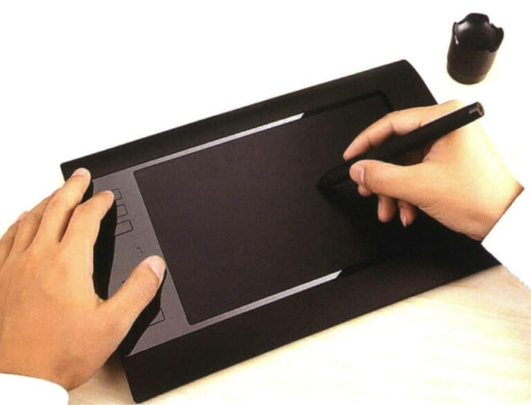
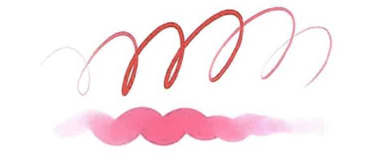
The main parameters of a graphics tablet include pressure sensitivity, coordinate accuracy, reading speed, and resolution, among which the level of pressure sensitivity is a key parameter. Generally, entry-level pressure sensitivity values are 1024, while a more common pressure sensitivity value is 2048. The higher the pressure sensitivity, the more precise the thickness of the lines drawn.
Tips
If the graphics tablet is not used for a long time, it should be covered with a cloth, and the power connector should be unplugged. When using the graphics tablet, avoid dropping or hitting it hard.
1.7 Watercolor Brush


Tips
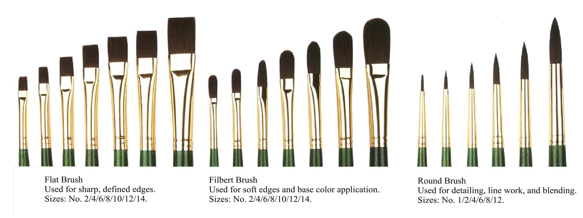
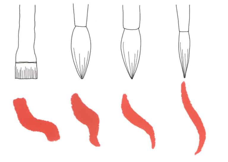
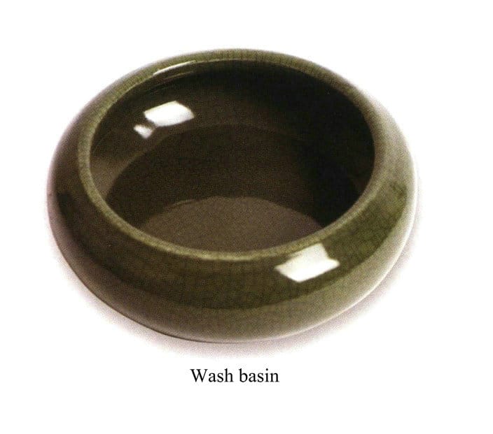
When you first start learning, there is no need to buy top-quality watercolor brushes; ordinary domestic or hair brushes can serve as creative tools. You can purchase brushes that suit your needs based on your financial situation and specific requirements.
1.8 Watercolor Paint
There are many types of watercolor paints, commonly including Japanese Sakura solid, Van Gogh solid, Windsor & Newton domestic, Moli domestic, Taiwan Lion solid, and Japanese Kuretake solid. The watercolor paints available on the market mainly come in solid and tube forms. Solid paints are convenient to carry, making them suitable for small-scale creations and sketches, while tube paints are more appropriate for larger paintings. However, the application method is not absolute and mainly depends on personal preference and usage habits.
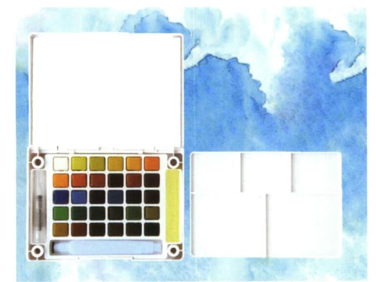
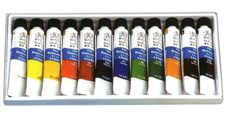

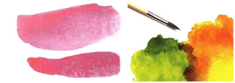
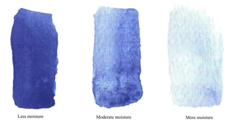
Watercolor painting primarily highlights its beauty through the blending of colors and control of moisture. Watercolor paints are thinner, resulting in a transparent, bright, and comfortable appearance. Additionally, watercolor painting uses water as a medium, relying on the moisture in the brush to dissolve the paint before it seeps into the watercolor paper. If there is too much water, the colors on the canvas will flow everywhere, making it difficult to control shapes and colors; if there is too little water, the colors will be dry, losing the transparency and luster characteristic of watercolor, and the blending effect will be poor. Therefore, controlling moisture is crucial, and continuous practice is needed during the learning process to gradually master and adapt to it.
Due to the poor coverage of watercolor colors and some bright colors lacking coverage, watercolor paintings must be completed in one to two layers and cannot be repeatedly applied. It is not suitable for multiple depictions and modifications. Furthermore, watercolor paintings are not easy to modify over large areas; if a large area of color is applied incorrectly, it is best to discard the work and start over, as the modified effect will certainly not be good.
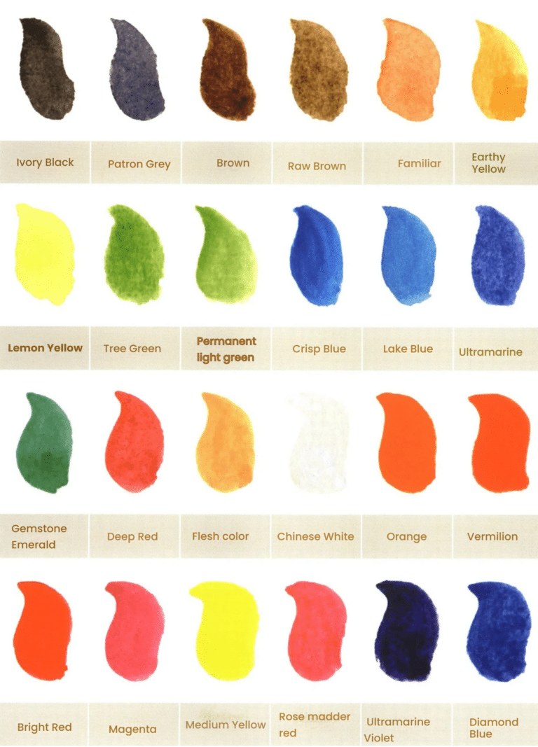
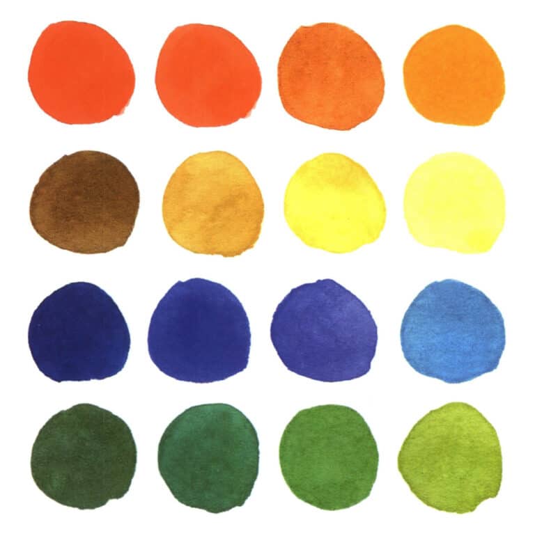
Commonly used watercolor paint brands include Maimeri, Japanese Sakura, Taiwan’s Lion Brand, and Winsor & Newton. Here, a 24-color color card has been created using the Winsor & Newton brand, which offers good value for money for readers to understand and reference.
1.9 Drawing Paper

A good watercolor paper needs to withstand enough moisture and ensure that the moisture flows on the surface of the paper without quickly soaking in.
Tips
Watercolor paper also comes in different textures, and the choice should be based on personal preference and the desired effect to be drawn. Beginners can try several different effects while practicing.
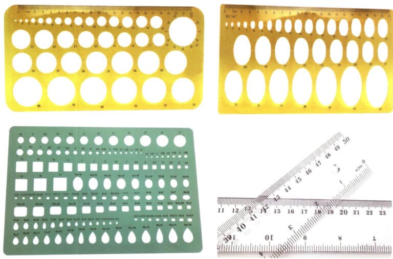
1.10 Drawing Templates and Rulers
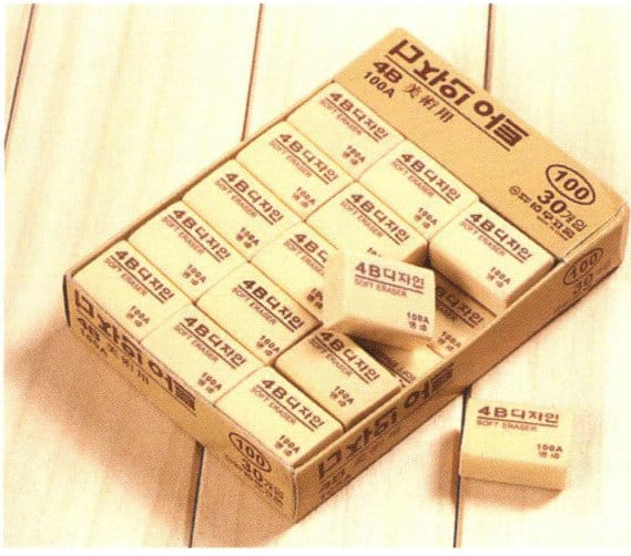
1.11 Eraser
Tips
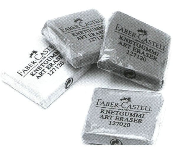
Soft eraser, or plasticine, can be molded into various shapes. It can erase large drawing areas and finely erase very small details.
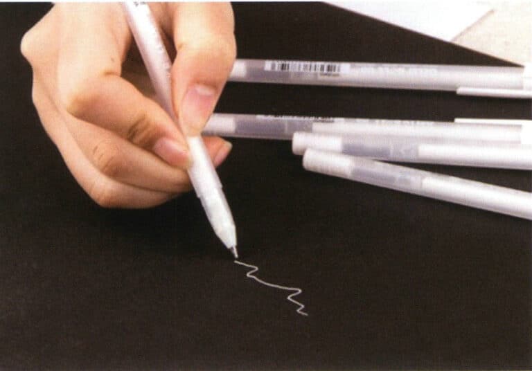
1.12 Highlight Pen


2. Structure and Perspective
2.1 Principles of Perspective
Perspective drawings have the characteristics of objects appearing larger when closer and smaller when farther away, higher when closer and lower when farther away, longer when closer and shorter when farther away, as well as parallel lines converging at a single point.
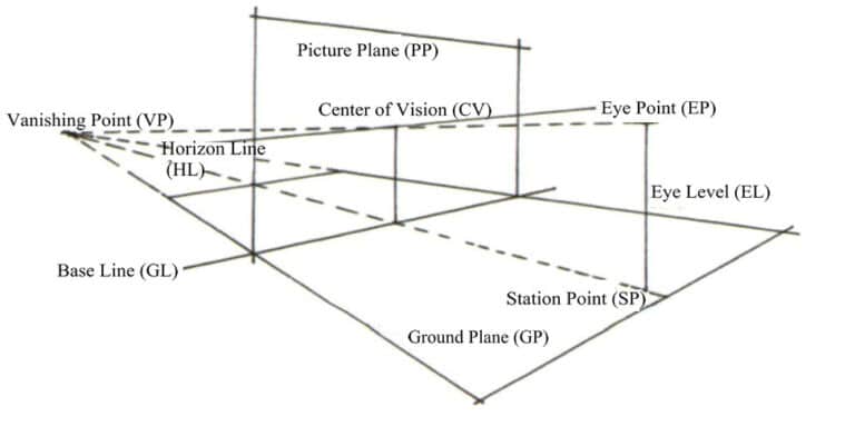
The basic terms of perspective are as follows.
Ground Plane (GP): The plane that supports the object (the subject of observation), such as a tabletop. In perspective theory, the horizontal plane based on the ground plane is the default and is always in a horizontal state, forming a perpendicular relationship with the picture.
Station Point (SP): The position where the observer stands.
Eye Point (EP): The position of the observer’s eyes.
Eye Level (EL): The vertical distance between the viewpoint and the station.
Horizon Line (HL): A horizontal line extending left and right from the viewpoint.
Vanishing Point (VP): The disappearance point is the intersection point of perspective lines that are parallel in space, converging on the horizon line in the picture.
Tips
Although the basic concepts are complex, beginners only need to understand the vanishing point and the horizon line.
2.2 One-Point Perspective
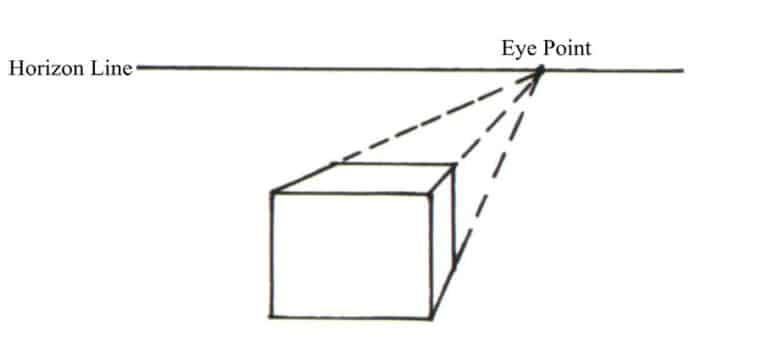
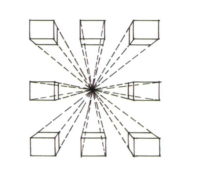
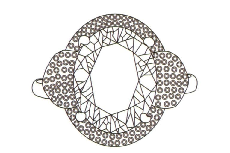
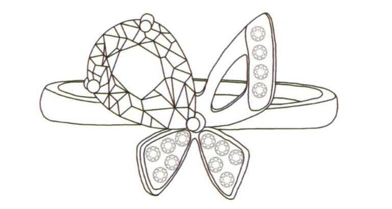
One-point perspective, also known as parallel perspective, is based on the principle that there is only one vanishing point in the perspective structure. Below are examples of the basic drawing method of one-point perspective and the hand-drawn effects of one-point perspective in jewelry design.
2.3 Two-Point Perspective
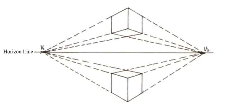
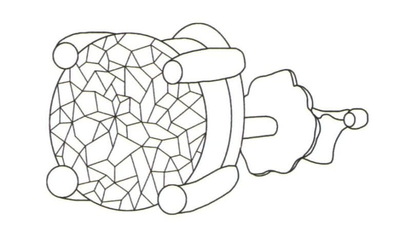
Tips
The expression of two-point perspective is more free and lively, and the space is closer to the real feeling.
2.4 Three-Point Perspective
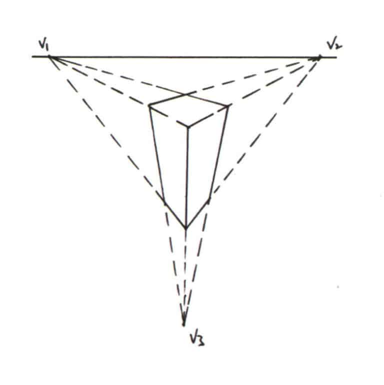
The three-point perspective, also known as the oblique perspective, is determined by the angular relationship between the line of sight and the object, such as in the low-angle and bird’s-eye perspectives. These perspectives all belong to the three-point perspective. The three-point perspective has three vanishing points, which gives the jewelry a strong sense of depth. Compared to the parallel perspective, it is more exaggerated and dramatic, but if the angle and distance are not chosen properly, it can lead to distortion and deformation.
The following will provide examples of the basic drawing methods of a three-point perspective and the hand-drawn effects of jewelry design in a three-point perspective.
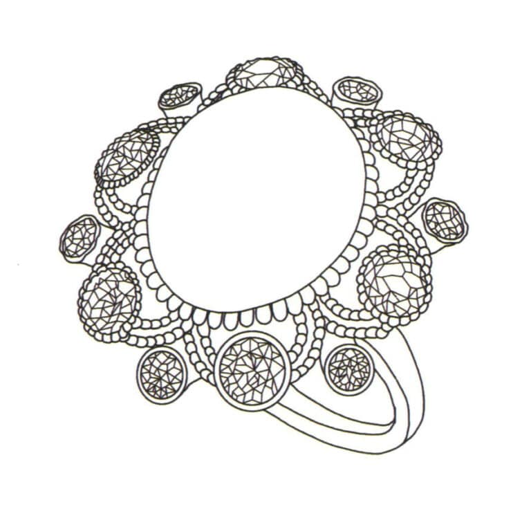
Tips
Three-point perspective is often used to represent jewelry from a bird’s-eye or worm’s-eye view, allowing the design of jewelry to be expressed with greater impact.
2.5 Cutting Structures of Different Gemstones
The cut can transform an ordinary rough stone into a gemstone, giving it a dazzling brilliance and stunning appearance. These processed gemstones can be set into various fashionable jewelry, such as rings and earrings. Understanding the cutting techniques of gemstones is beneficial for selecting jewelry that suits oneself better. Next, we will introduce several common gemstone-cutting techniques.
(1) Millennium Cut: It has 1000 facets, with 624 facets in the crown and 376 facets in the pavilion. Due to the time-consuming and labor-intensive nature of this cutting technique and its high difficulty and cost, it is not suitable for semi-precious stones.
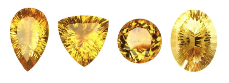
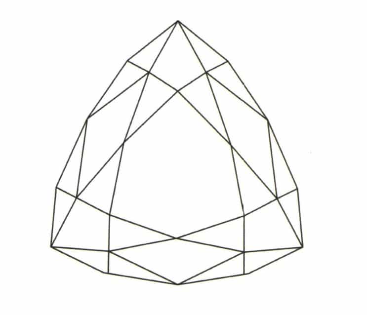
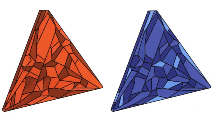
(2) Trillion Cut: The standard number of facets is 43, and the generally best length-to-width ratio is 1:1. This cutting technique can reflect most light and color, providing a dazzling visual effect. It is suitable for cutting light-colored gemstones, such as aquamarine and beryl.
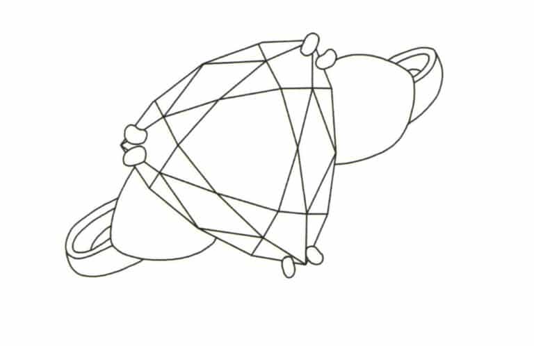
(3) Calibre Cut: It is one of the more popular cutting techniques in the market, generally divided into single and double-sided, with each side square or diamond-shaped. The jewelry styles produced are novel, unique, simple, bright, and modern.


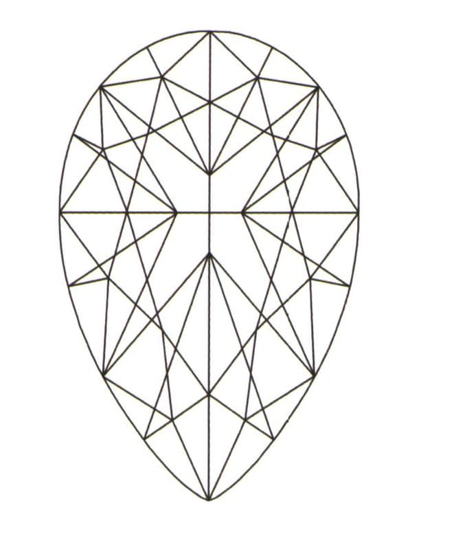
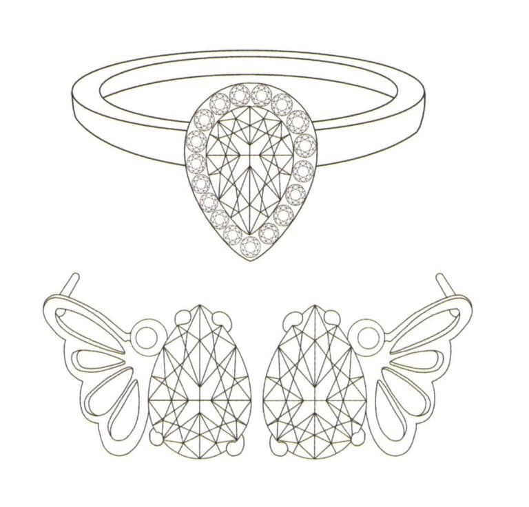
(4) Pear-shaped Cut: It has 71 facets and belongs to a mixed-cutting method. The cut gem resembles a droplet or teardrop, and the best appearance ratio for length to width is 1.5:1.
(5) Emerald Cut: It has 50 facets and, from a top view, looks like a rectangle with four corners cut off. It suits all transparent gemstones, but the most beautiful color is paramount. The best length-to-width ratio is generally 1.5:1~1.75:1.

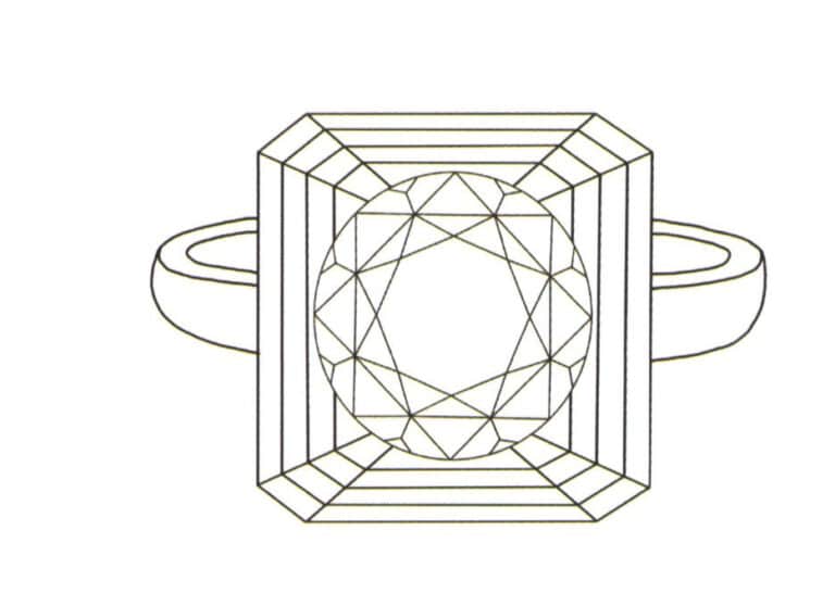
(6) Round Cut: Also known as round brilliant cut, it has 57 facets. This cutting method primarily provides the maximum optical effect and is especially suitable for diamonds.

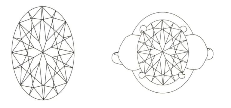
(7) Oval Cut: It has 69 facets, and its length-to-width ratio depends on the characteristics of different types of gemstones, generally around 2:1.
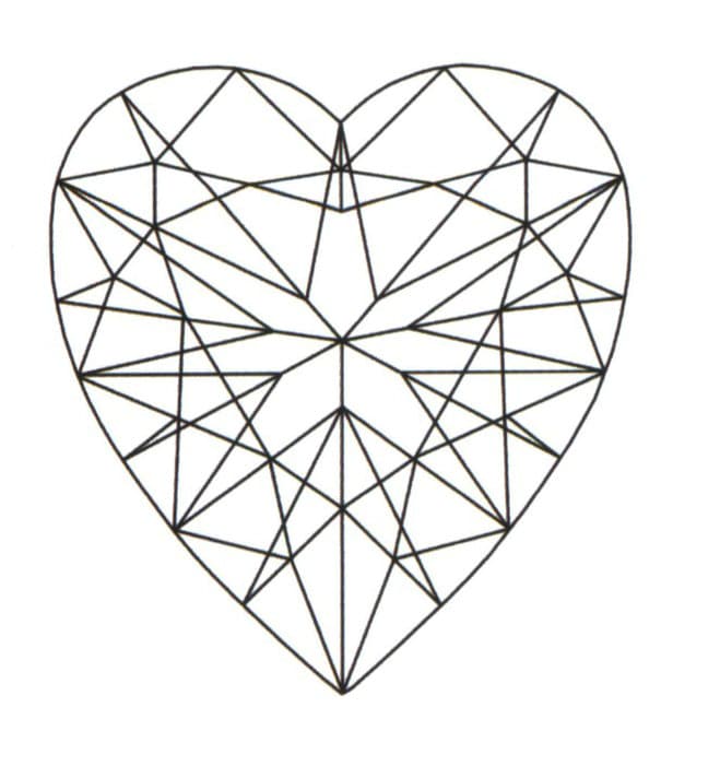
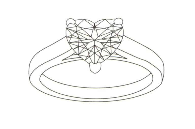
(8) Heart Cut: It has 59 facets, and the typical length-to-width ratio is about 1.1:1. Since the heart shape symbolizes love, heart cut gemstones sell very well in the market.
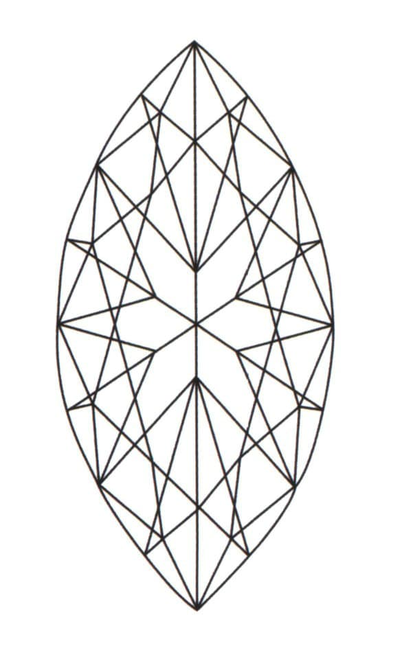
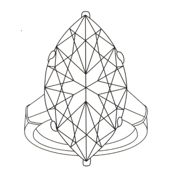
(9) Marquise cut: Also known as “spindle” cut, the standard number of facets is 57, and the typical length-to-width ratio is 2:1. This cutting method cannot be too shallow; otherwise, light will penetrate the back of the gemstone, easily weakening its luster and color.
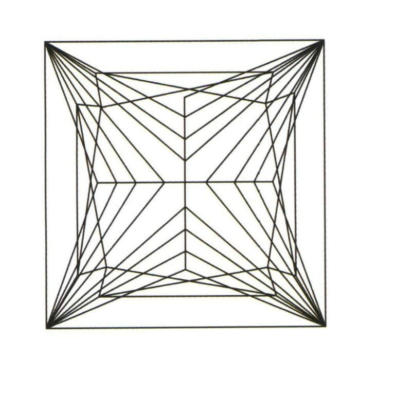
Princess Cut Example
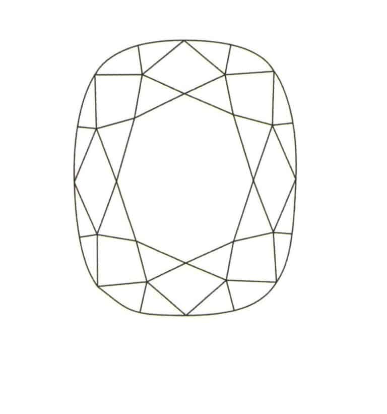
Cushion Cut Example
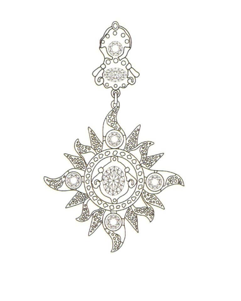
Example 1 of Different Shape Cutting Techniques
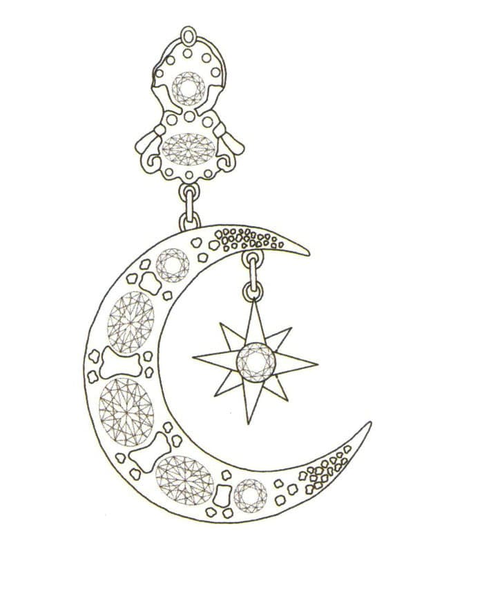
Example 2 of Different Shape Cutting Techniques
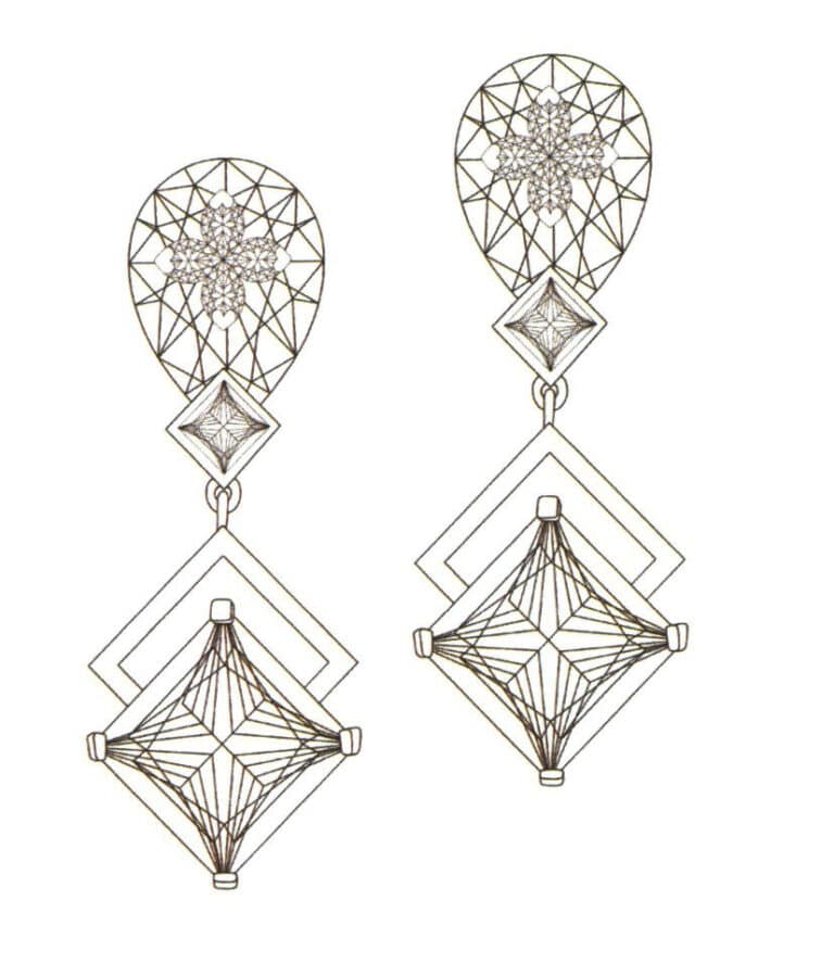
Example 3 of Different Shape Cutting Techniques
Copywrite @ Sobling.Jewelry — Custom jewelry manufacturer, OEM and ODM jewelry factory
3. Line Practice
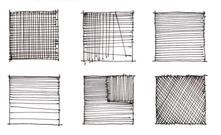
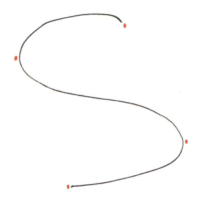
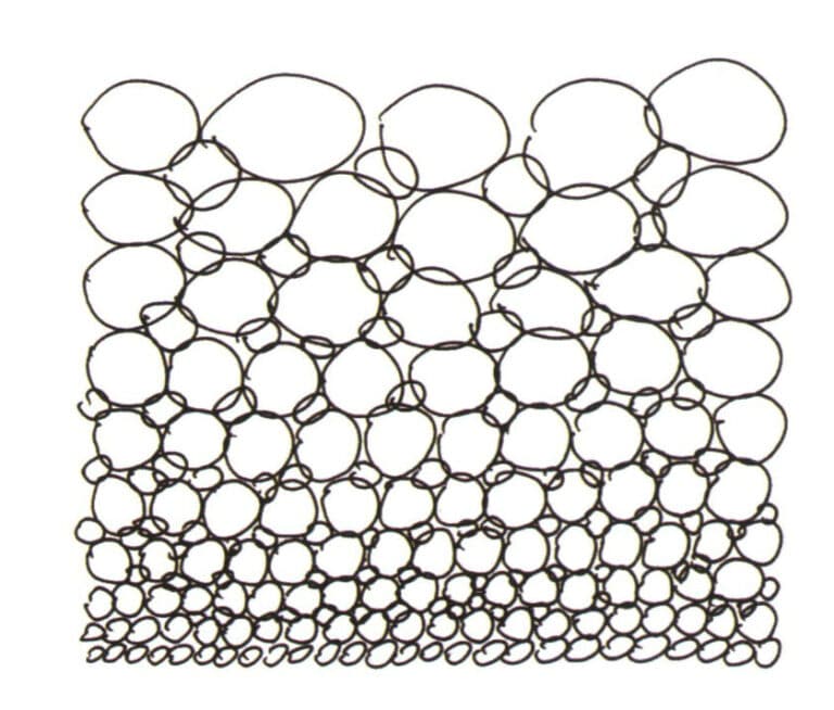
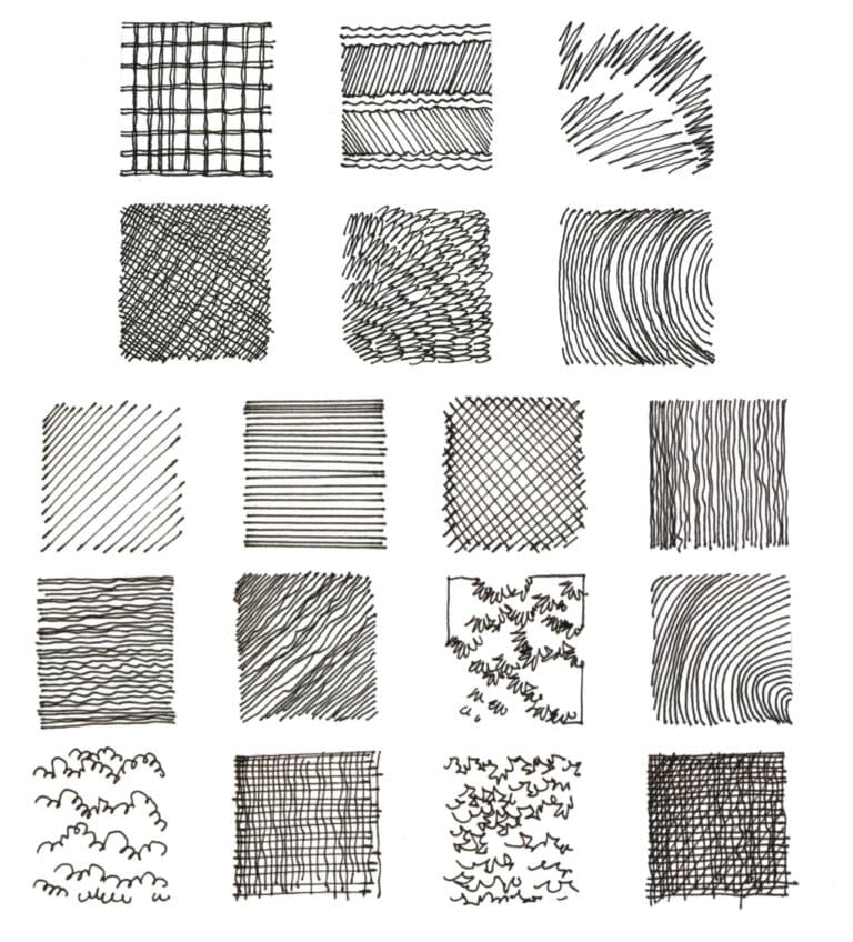
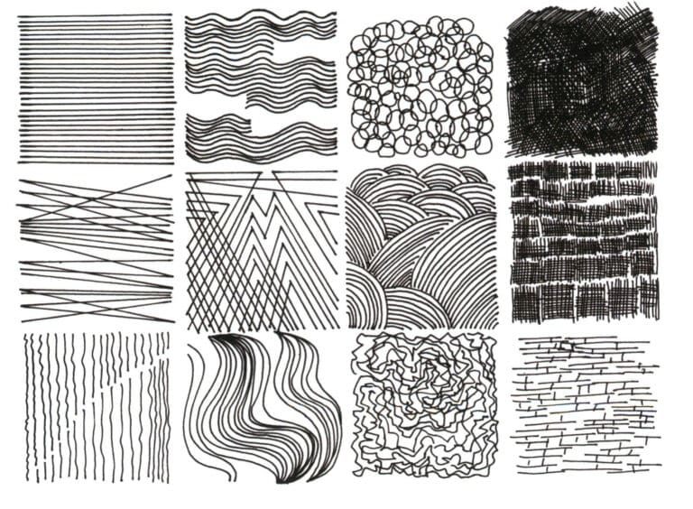
Lines are fundamental to the hand-drawing representation of jewelry. The structural transitions and details of jewelry are all reflected through lines. Mastering the drawing of lines is the first step in learning hand-drawn jewelry design. At the same time, the flexible application of various line techniques is a skill that designers must master. Next, we will provide a detailed introduction to straight lines, curves, shaky lines, common issues with lines, line practice examples, and the comprehensive use of lines.
When drawing straight lines, be sure to keep your hand relaxed. Draw one line at a time, and do not draw in small segments back and forth. If the line is too long, it can be broken and drawn in parts; if connected, it is easy to create nodes, which can give a feeling of insecurity. A straight line should have a starting point, a drawing motion, and an ending point.
There are two methods for representing straight lines: one is freehand drawing, and the other is using a ruler. These two forms of representation can be chosen based on different situations.
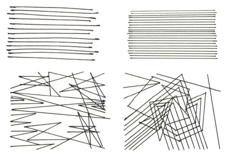
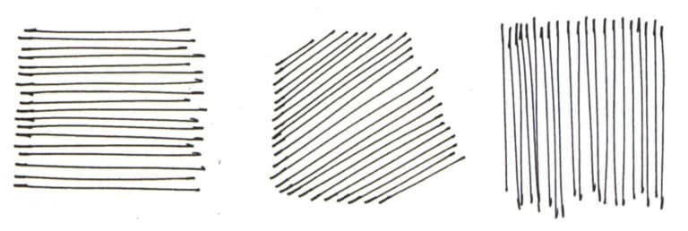
The important conditions for practicing drawing straight lines are to be smooth, quick, fresh, and stable in your strokes.
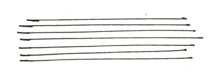
To draw straight lines, you must first ensure the accuracy of the lines. Pay attention to the strength of the initial stroke, gradually reduce the pressure while drawing, and maintain a steady speed. When finishing the stroke, pause slightly. Additionally, emphasize the intersection of two lines slightly, allowing them to protrude a bit. When drawing straight lines, be confident and calm, and ensure that the ends are heavier while the middle is lighter.
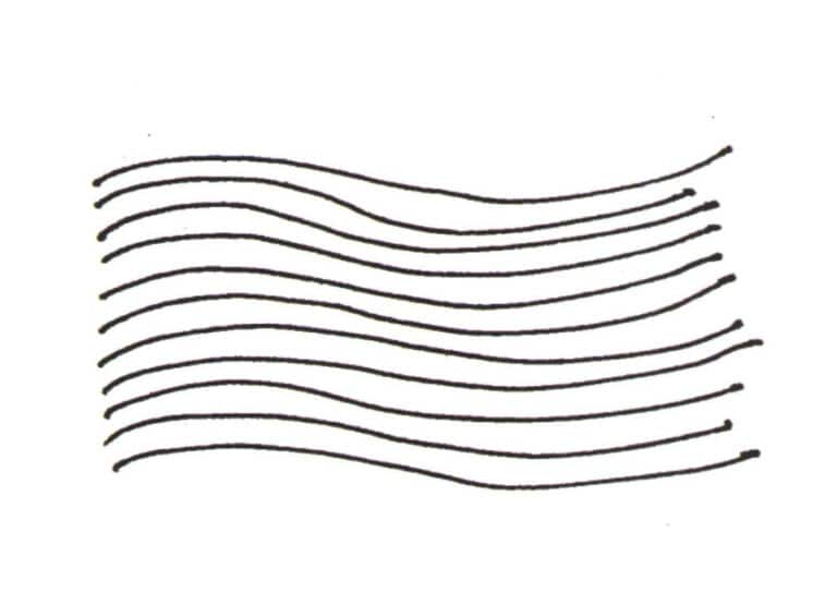
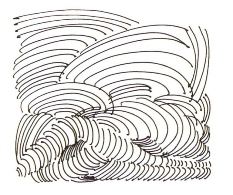
The shaky line is a type of line produced by the trembling of the hand while drawing. The characteristics of a shaky line are rich variations and a lively appearance. Shaky lines emphasize natural flow; even if they are broken, they should visually give the impression that they can be connected.
Shaky lines can be arranged in a relatively orderly manner. By arranging orderly, shaky lines, various densities of surfaces can be formed, creating light and shadow relationships within the picture. Shaky lines can be interspersed among various lines, working with other line types to create spatial effects.

4. Hand-Drawing Posture
4.1 Grip Posture
When writing, people tend to grip the pen tightly and hold it closer to the front, but when drawing, the grip should be relaxed, and the fingers should be positioned further back, held at two third. When painting, the second joint of the little finger should be the contact point with the paper, with the support point being this joint rather than a line or a surface. The arm should be about an arm’s length away from the easel to allow for proper extension.
The following will introduce the grip when drawing lines and the issues to pay attention to while moving the pen.
(1) The finger joints and wrists should maintain their original posture, and the lines are created through the overall movement of the arm.
(2) The side of the hand should not be suspended; it must be in contact with the paper. Otherwise, it can easily cause an unstable center of gravity and uncertain lines.

4.2 Sitting Posture

Section II The Use of Color
1. Basic Knowledge of Color
1.1 Properties of Color
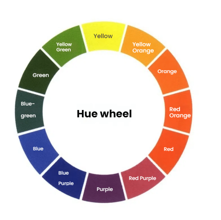
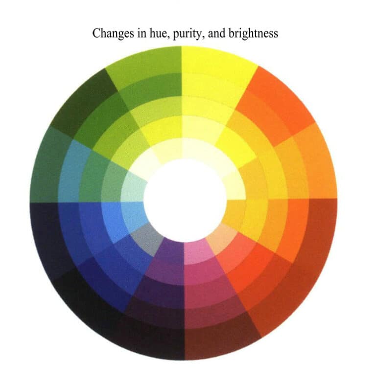
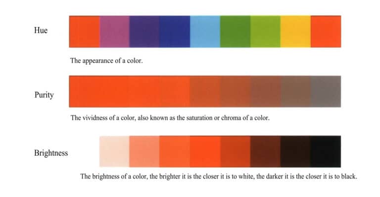
Color is divided into three properties: hue, brightness, and purity. Hue is the primary characteristic of color and is the most accurate standard for distinguishing various colors. Brightness refers to the lightness or darkness of color, which is mainly determined by light intensity and is a visual experience. Purity usually refers to the vividness of color, also known as saturation.
The image below shows the color wheel and the variations of hue, brightness, and purity of colors to help everyone understand the basic colors.
1.2 Three Types of Colors
(1) Local Color
Local color refers to the original color of an object, which is the object’s color. It refers to the color of the object’s inherent properties under normal lighting conditions.
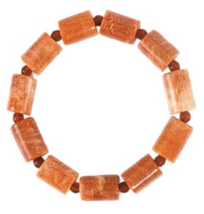
The most obvious place where an object presents its local color is the middle between the lit and backlit surfaces, corresponding to the gray area in the sketch tones. In this range, the object’s color is less influenced by external conditions, and its changes are mainly variations in brightness and hue itself. Since the local color occupies the largest area in an object, studying it becomes very important. The left image shows the effect of local color in jewelry design.
(2) Light Source Color
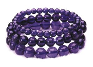
The light source color refers to the color presented when a certain light (such as sunlight, moonlight, or artificial light) shines on a white, smooth, opaque object. The right image shows the effect of the light source color under lighting in jewelry design.
(3) Reflected Color
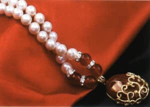
The reflected color refers to the color presented by the environment under light illumination. When the surface of an object is illuminated, it not only absorbs a certain amount of light but also reflects it onto surrounding objects. Smooth materials, in particular, have a strong reflective effect, and this is especially noticeable in the darker areas. The existence and variation of reflected color enhance the color resonance and connection between different elements in the picture, subtly expressing the texture of objects and greatly enriching the colors within the composition.
Below is a demonstration of the effects of reflected color on jewelry design.
1.3 Characteristics of Color
Color itself has no distinction between warm and cool; the perception of warmth and coolness in color is based on human psychology, physiology, and life experiences. It is a subjective understanding of color. Generally speaking, the main illuminated surface of an object directly exposed to a light source appears brighter, making that part of the object’s color seem warmer. Conversely, the shaded side that is not exposed to the light source appears cooler.
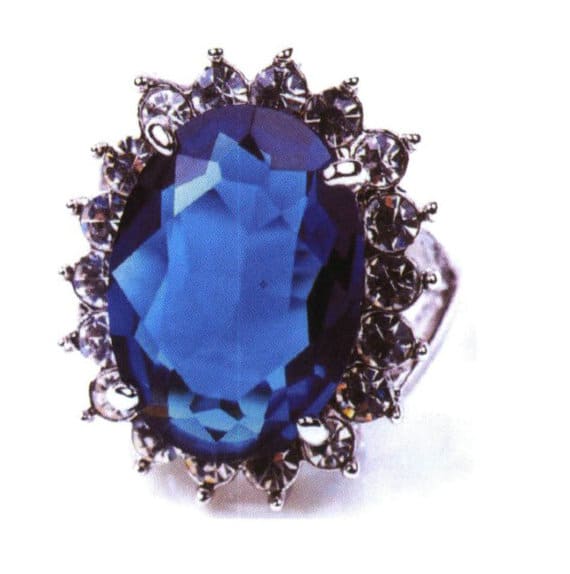
(1) Cool Colors
Blue tones are the main source of cool colors, such as blue, cyan, and green. Cool tones often give a sense of distance, evoking feelings of calmness and coolness.

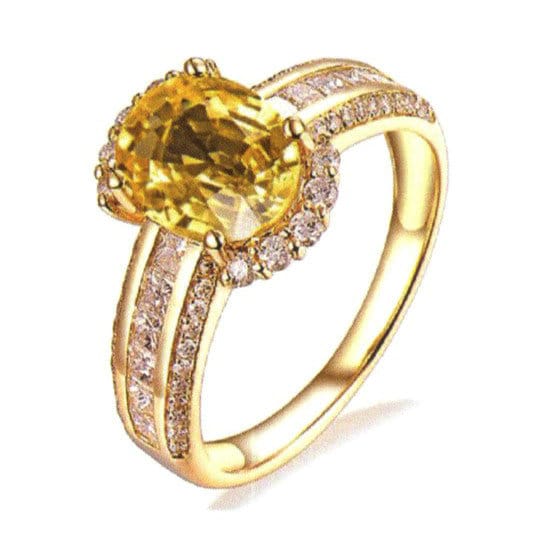
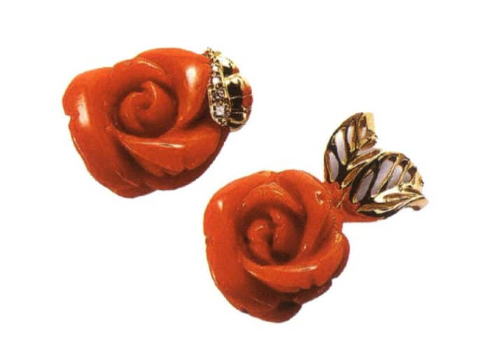
(2) Warm Colors
Warm colors are derived from the colors of the sun, such as red, orange, and yellow. Warm tones often give a feeling of warmth, friendliness, and comfort.
2. Marker Coloring Techniques
2.1 Marker Brush Strokes
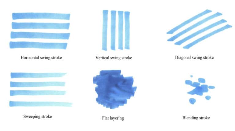
The method of using markers is mostly reflected through different brush strokes. Brush strokes are the most effective way to showcase the performance of marker drawings. Below, we will introduce the commonly used horizontal swing, vertical swing, diagonal swing, sweeping, flat layering, and blending strokes in jewelry design hand-drawing.
(1) Horizontal Swing Stroke
Horizontal swing strokes are simple parallel lines that ultimately emphasize the effect of the surface, establishing a sense of order in the drawing. The connection marks between each stroke will be quite noticeable. It mainly involves moving the brush from left to right, emphasizing speed and clarity, and striving for a certain force. Do not move the brush slowly, as this will make the strokes unclear and appear messy. Horizontal swing strokes are suitable for shaping large space areas, with neat strokes with a certain sense of order.
(2) Vertical Swing Stroke
A vertical swing stroke is characterized by a simple vertical alignment of lines, with the brush moving from top to bottom. The brush should be slightly fast to convey a crisp and powerful effect.
(3) Diagonal Swing Stroke
A diagonal swing stroke, or a diagonal sweeping, is an unavoidable brush stroke in perspective when drawing objects in the scene. The intersection of two lines creates angles, and at this point, it is necessary to use diagonal swing strokes to keep the drawing neat. If horizontal swing strokes are used, they will exceed the line boundaries, resulting in a jagged appearance that affects the aesthetic of the drawing.
During the diagonal swing stroke process, pay attention to the changes in the angle of the lines. The fine lines can be depicted using the tip of a marker, but be careful not to over-embellish the fine lines, as it may make the drawing appear cluttered.
(4) Sweeping Stroke
The sweeping stroke technique requires speed, with a heavier initial stroke and no lifting of the brush. The tip of the brush does not directly touch the paper at the end, allowing for variations in depth and transitions, making it an advanced technique. Note that the absence of a clear lift does not mean a careless stroke; it still requires some directional control and length requirements, simply emphasizing the noticeable weakening changes. The sweeping stroke is most commonly seen when depicting light effects.
(5) Flat Layering
Flat layering has no traces, just like painting a wall, without a sense of shape; it is simply coloring. It presents a relatively uniform color without variation, and the surface of the color layer is relatively smooth, mainly used for drawing small areas or irregular shapes that cannot be completed with the above brush strokes.
(6) Blending Stroke
Blending stroke, or feathering stroke, requires softness and natural transitions, commonly used in depicting tree crowns, grass, clouds, and carpets. It is important to pay attention to changes in shape and variations in the size of the dots. Its characteristic is that the brush strokes are not primarily lines but focus on painting areas. In terms of technique, it is the most flexible and casual. However, attention must be paid to the directionality and overall coherence of the dotting and to control the edge lines and density variations well, avoiding random blending to prevent a chaotic appearance in the painting.
Tips
The placement of the marker pen emphasizes quick and clear strokes, aiming for a certain strength, where each line drawn should have a clear beginning and end, making it appear complete and powerful. Moving the pen too slowly can lead to overly thick lines and unclear strokes. During practice, it is important to focus on multi-angle training to fully master and apply it in jewelry design sketching.
2.2 Marker Rendering Techniques
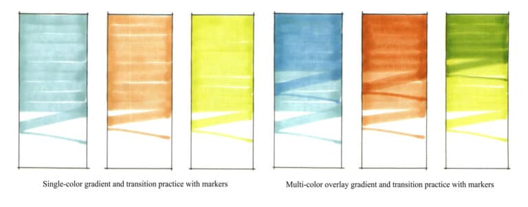
The tip of the marker is relatively small and unsuitable for large-area rendering, so a summarizing expression is needed for areas that are too large or too long, and necessary transitions should be made in the technique.
When practicing the transition of marker colors, pay attention to the variation in spacing and thickness between strokes. Learn to gradually increase the spacing using zigzag strokes, and you can roughly express the transition effect.
Below is a demonstration of single-color gradient and transition practice with markers and multi-color overlay gradient and transition practice.
2.3 The Color Usage Rules of Markers
The coloring with markers follows certain rules, as detailed below.
(1) First, use a cool gray or warm gray marker to draw the image’s basic light and dark tones.
(2) The number of strokes should not be excessive during the coloring process. After the first layer of color has dried, apply the second layer quickly and accurately. Otherwise, the colors may bleed and become muddy, losing the transparent and clean characteristics of the markers.
(3) When using markers, the strokes are mostly based on line arrangements, so organizing the direction and density of the lines regularly is beneficial for creating a unified visual style. Combining techniques such as dotting, skipping strokes, and leaving blank spaces is advisable, and using them flexibly.
(4) Markers do not have strong coverage, and light colors cannot cover dark colors. Therefore, during the coloring process of the rendering, one should first apply light colors and then cover them with darker colors. Additionally, attention should be paid to the harmony between colors; avoiding overly bright colors and neutral tones is preferable.
(5) Simply using markers will inevitably leave some shortcomings, so they should be combined with tools like colored pencils and watercolors. Sometimes, alcohol for further blending can create magical effects on the artwork.
3. Coloring Techniques with Colored Pencils
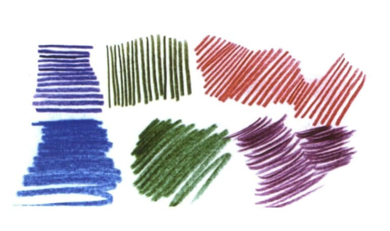
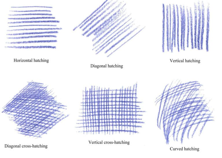
The use of colored pencils is mainly divided into two methods: one is the flat layering technique, and the other is the hatching technique. The flat layering technique is more commonly used in jewelry design sketches, often to represent local colors, while the hatching technique is used to depict details.
Different expressive techniques produce different effects, each with its characteristics. Next, we will showcase the effects of using colored pencils for flat layering and hatching.
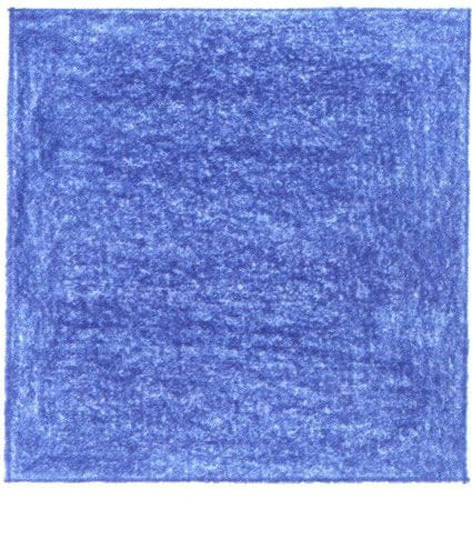
Monochrome flat layering
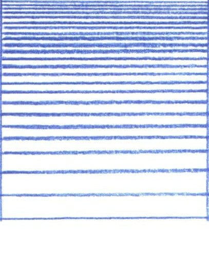
Monochrome hatching
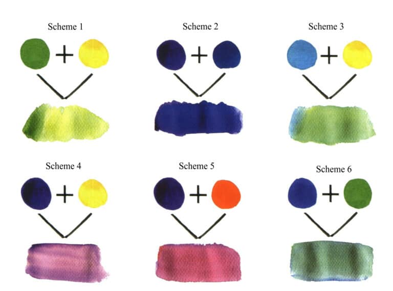
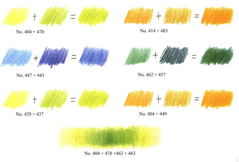
The colors of colored pencils have a transparent characteristic. When drawing, overlaying one pencil’s tone over another’s can produce new tonal effects. Below are examples of several common two-color and multi-color overlay schemes.
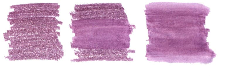
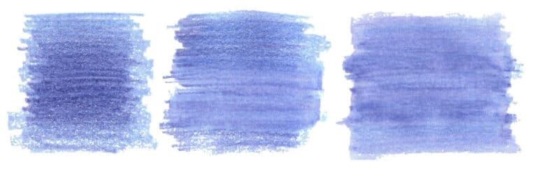
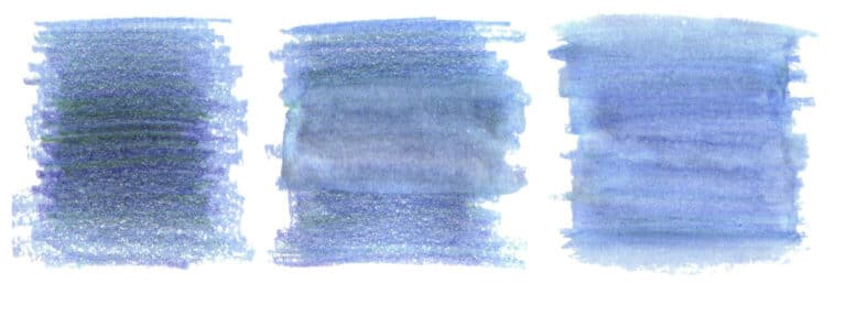
In addition, using the line drawing method with water-soluble colored pencils, watercolor pens, and water can also produce a blending effect similar to watercolor. Below, examples of monochrome blending, two-color blending, and multi-color blending will be provided.
4. Watercolor Coloring Techniques
4.1 Changes in the Amount of Watercolor Paint and Water

4.2 Layering Technique
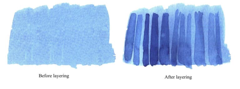
The layering technique is also one of the important methods for coloring in watercolor. The commonly used methods are wet-on-wet blending and dry layering techniques, and the following will explain these two different layering methods.
(1) Wet-On-Wet Blending Method
Wet-on-wet blending refers to applying the second and third colors directly before the first color dries, allowing the colors to blend well together and creating a more natural transition. This method is suitable for adding environmental and light source colors, enriching the color variations in the artwork, and adding depth.

(2) Dry Layering Method
Dry layering refers to applying the second layer of color after the first layer has completely dried. This way, the colors do not easily blend, allowing for better control over the shape and making it more suitable for refining shapes or drawing detailed parts.
4.3 Spattering Method
4.4 Manual Reserving Whites Method

5. Analysis of Color Matching in Jewelry Design Renderings
5.1 Analogous Colors
5.2 Complementary Colors

Example 1
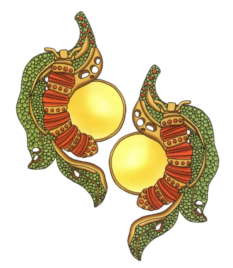
Example 2
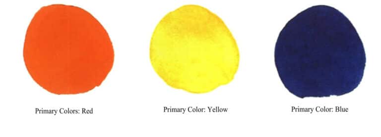
5.3 Primary Colors
