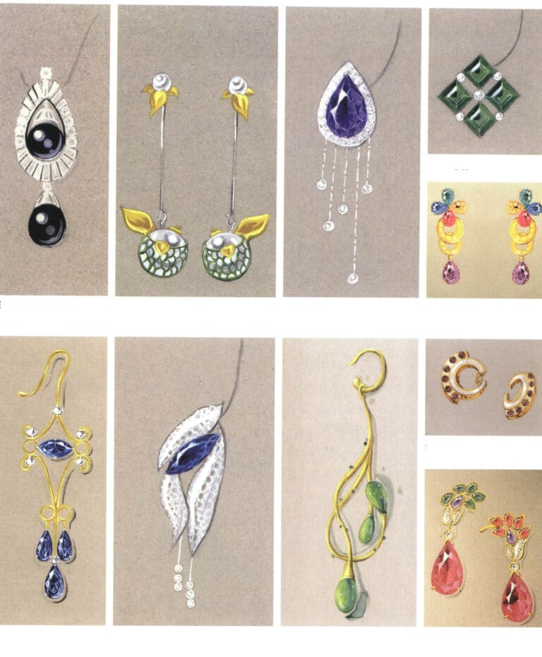
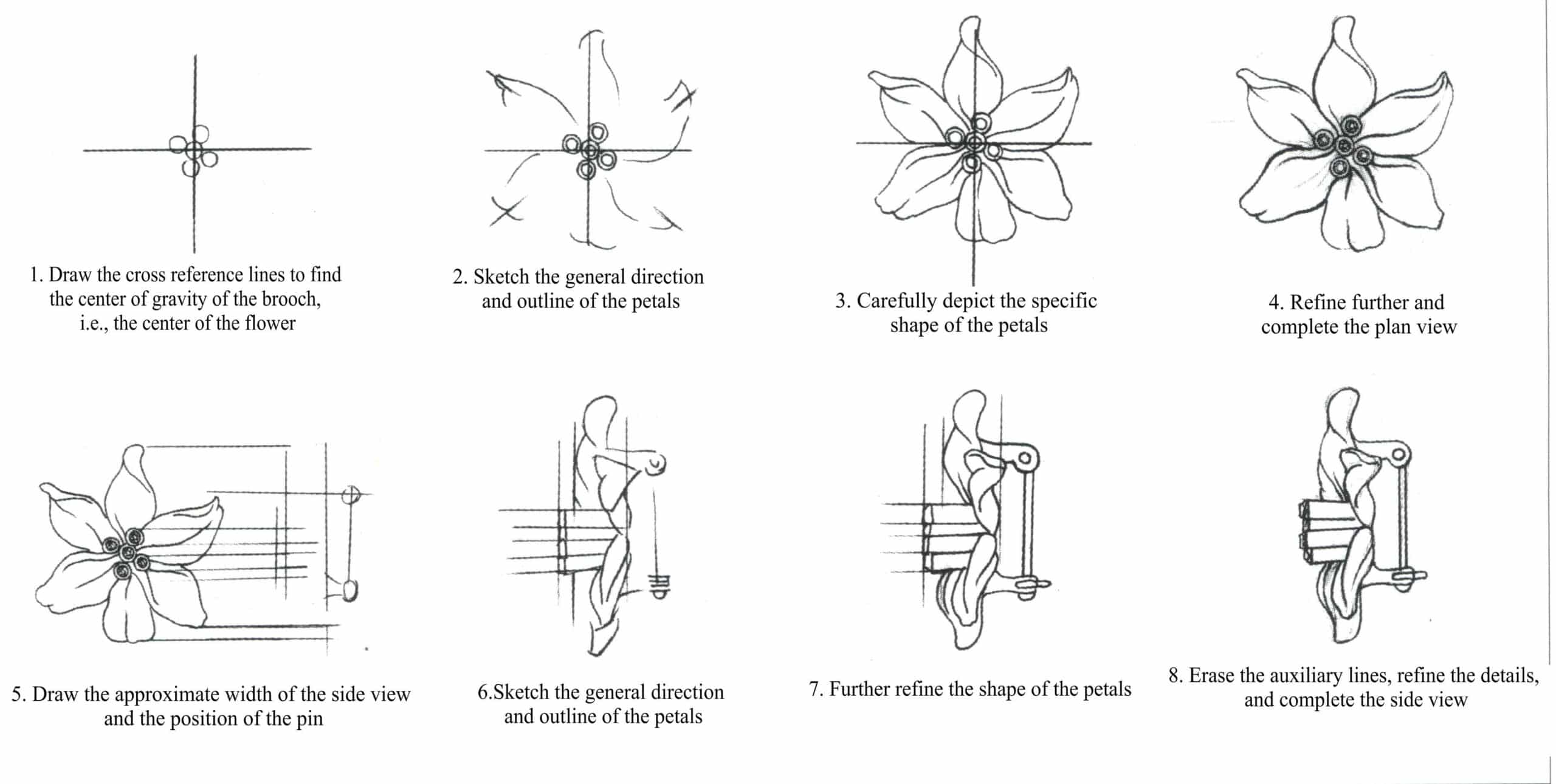
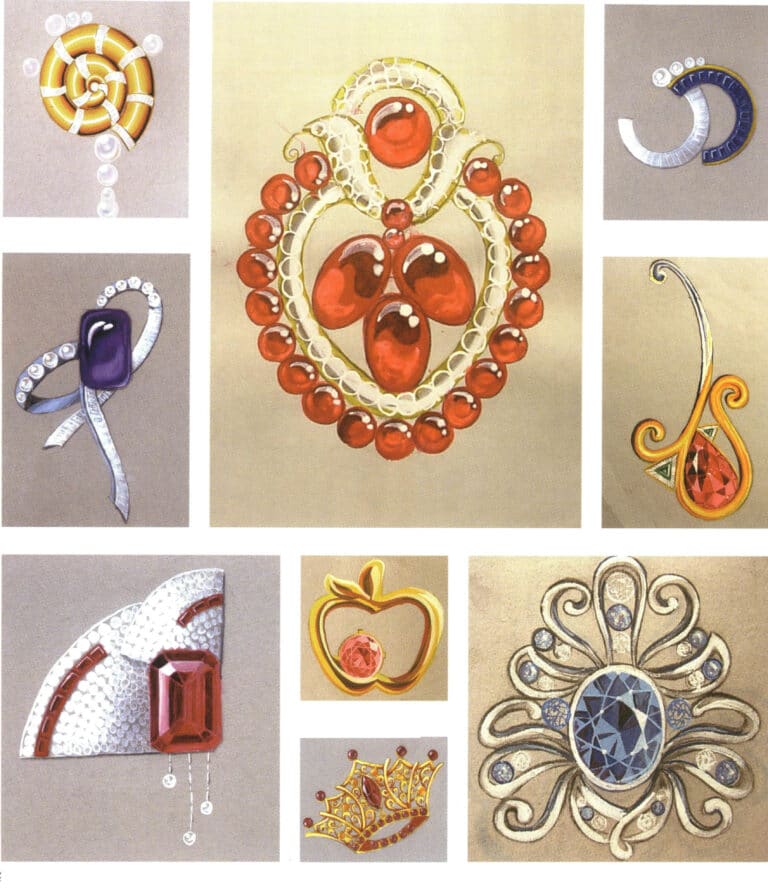
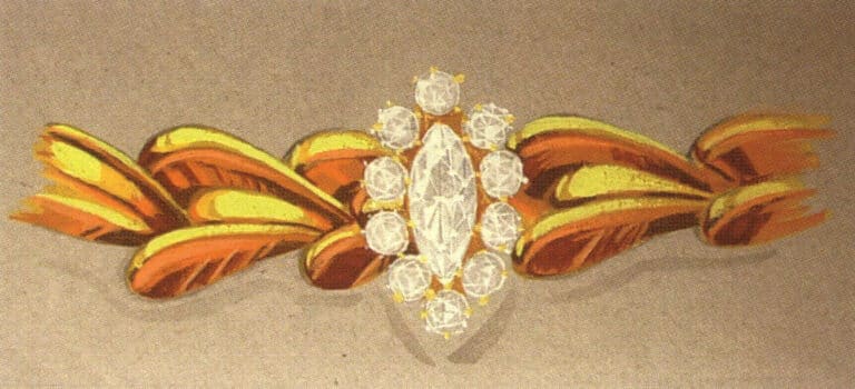
ブローチの表現
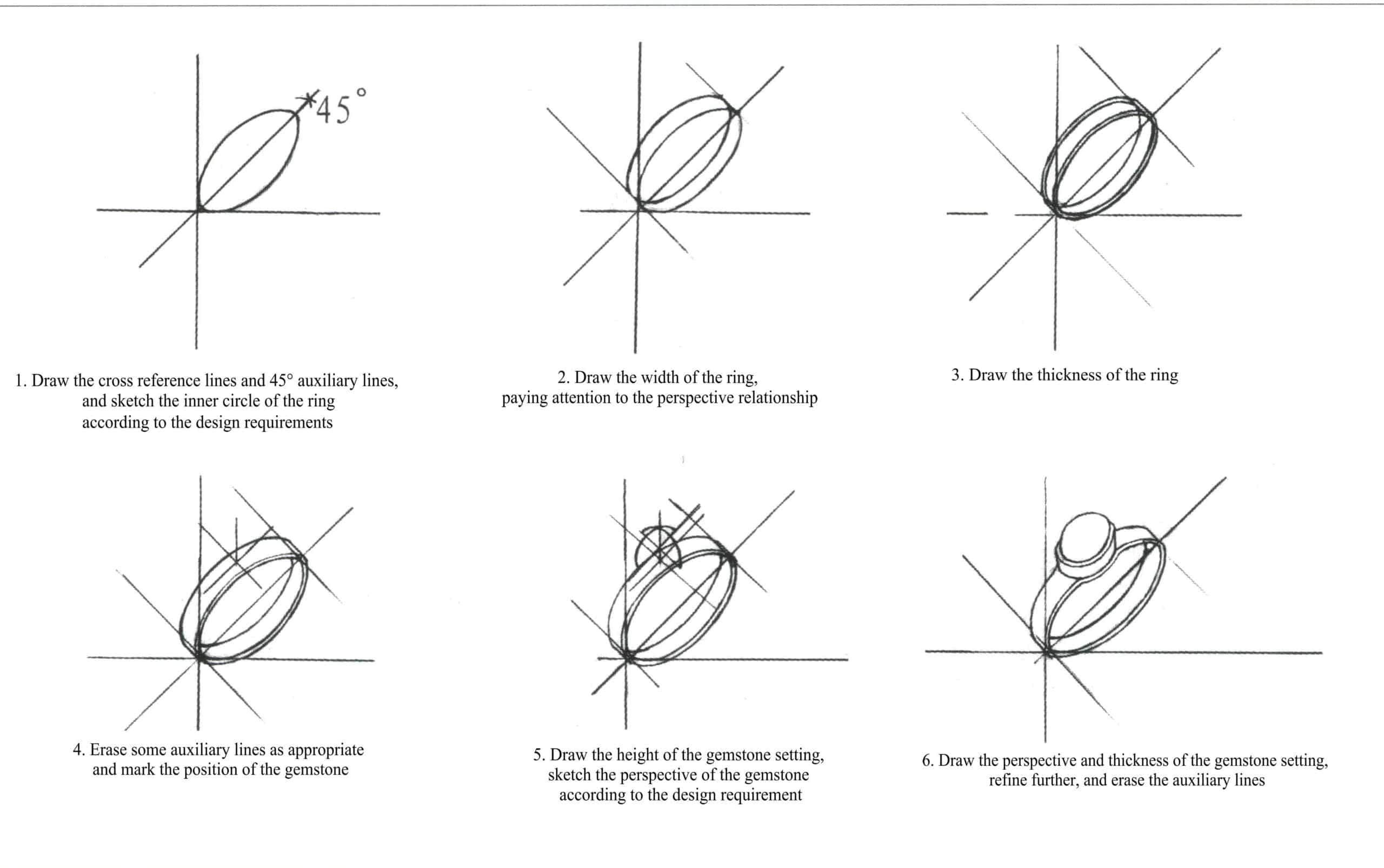
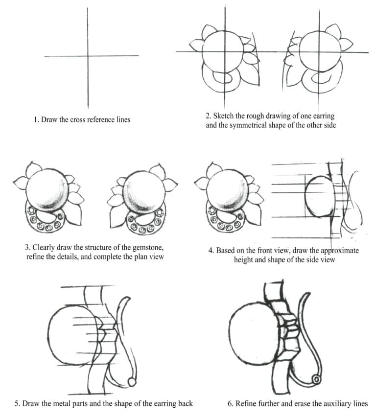
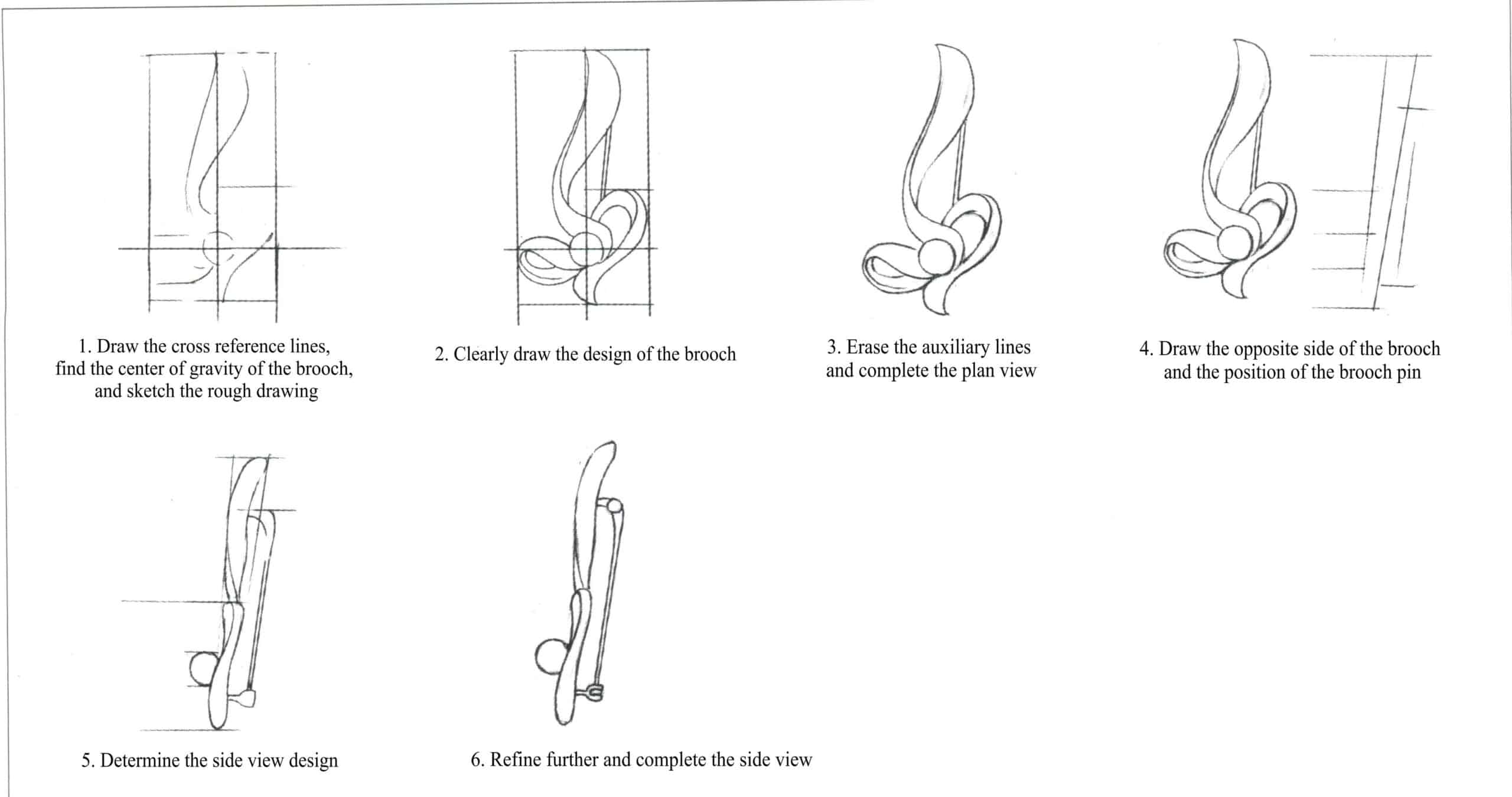
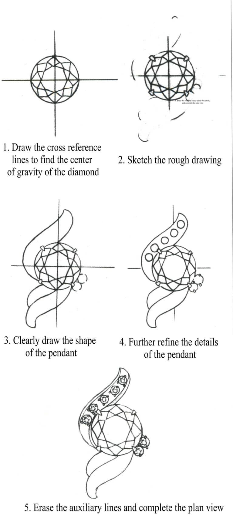
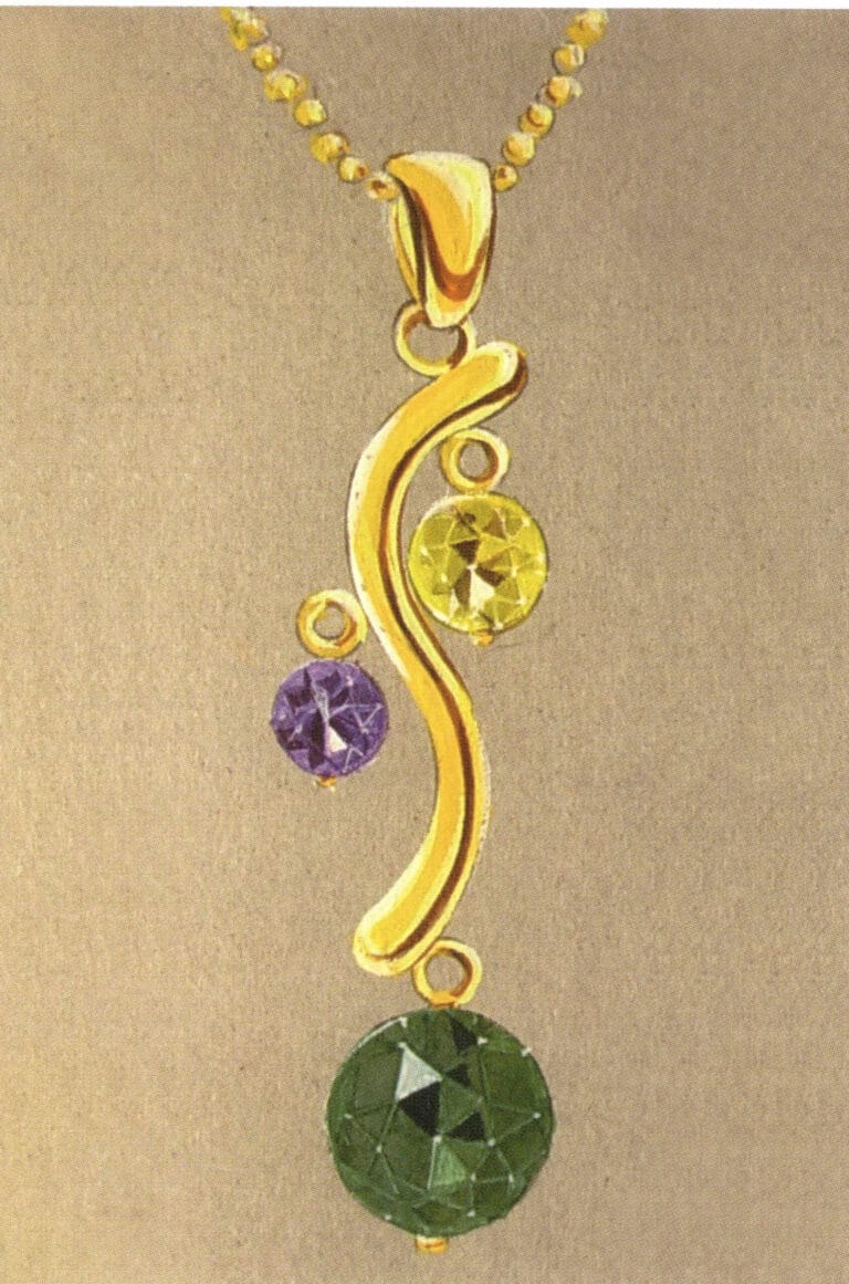
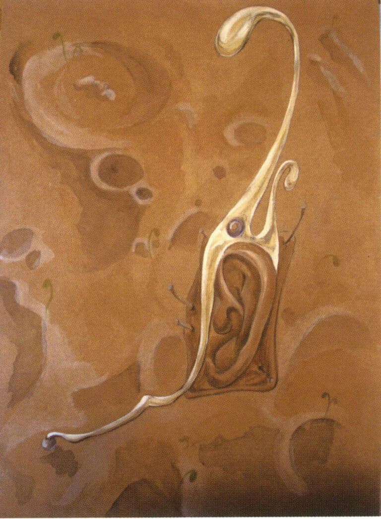
Steps for painting the front of the pendant
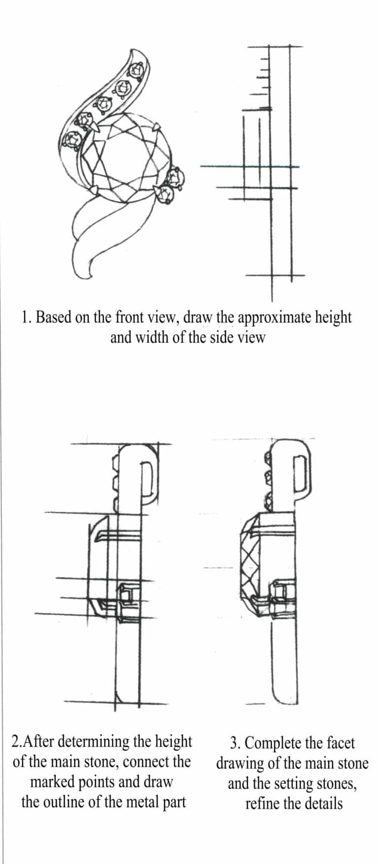
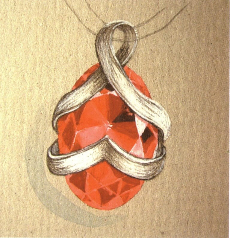
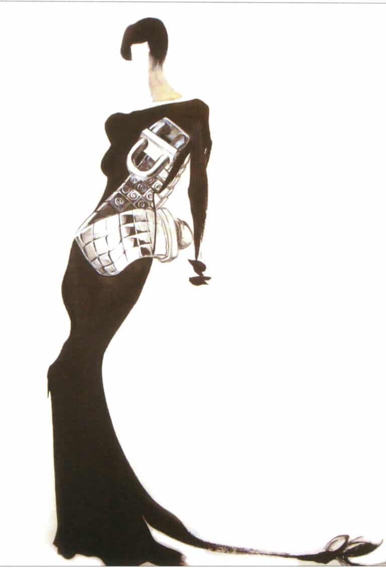
Steps for painting the side of the pendant

Techniques for Crafting Chain Links case 2
Techniques for Crafting Chain Links case 3
Techniques for Crafting Chain Links case 4
Techniques for Crafting Chain Links case 5
Techniques for Crafting Chain Links case 6
Techniques for Crafting Chain Links case 7
Techniques for Crafting Chain Links case 8
Techniques for Crafting Chain Links case 9
Techniques for Crafting Chain Links case 10
Techniques for Crafting Chain Links case 11

Techniques for Crafting Chain Links case 12
Techniques for Crafting Chain Links case 13
Techniques for Crafting Chain Links case 14
Techniques for Crafting Chain Links case 15
Techniques for Crafting Chain Links case 16
Techniques for Crafting Chain Links case 17
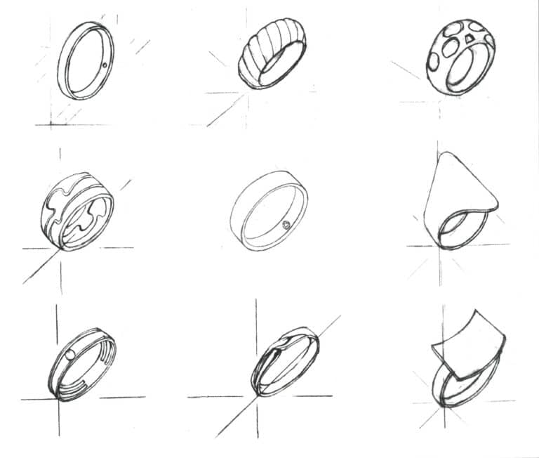
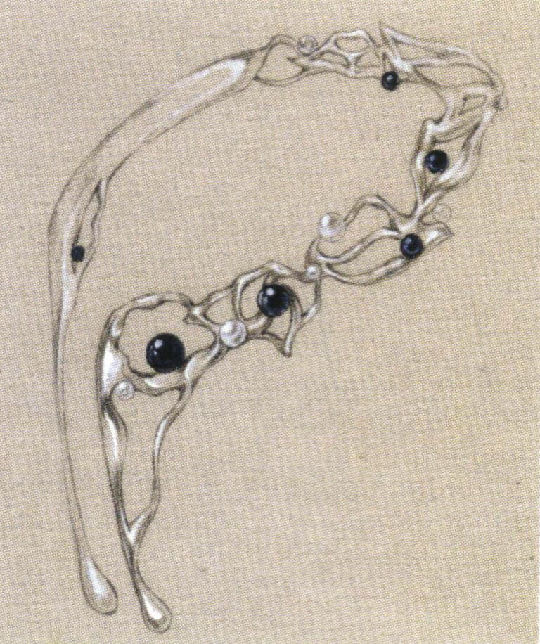
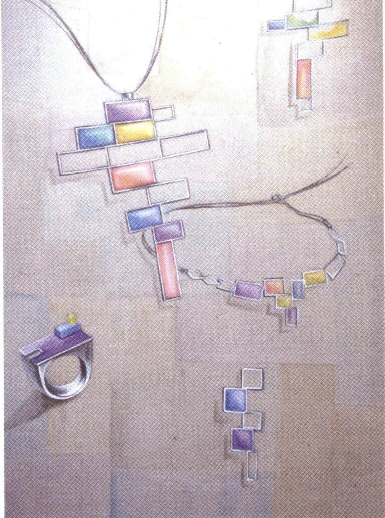
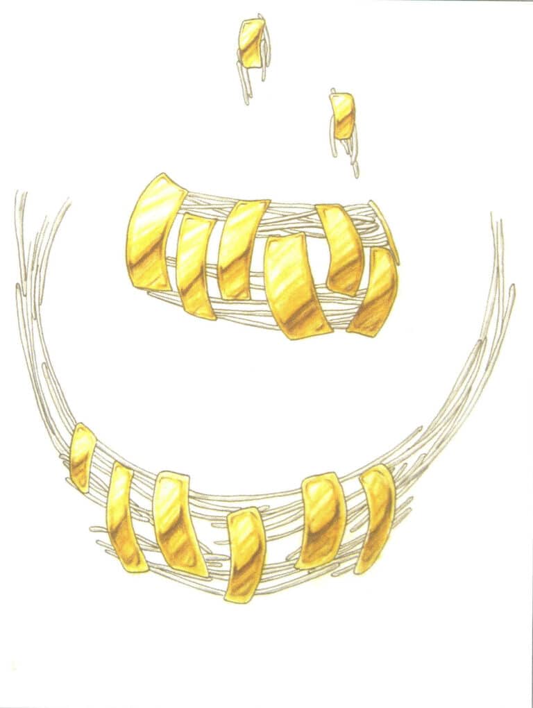
A series of bracelet designs expressed through sketching techniques. With just a few strokes, the texture of the bracelet is well-represented, and the method is simple, making it worth referencing.
The author pays great attention to the details of the painting, with careful depictions of some subtle parts. The color perception of different materials is relatively well grasped, but the perspective of some diamonds is not very accurate.

A distinctive bracelet design, the circular shape is a key element throughout the artwork. The composition is loose.
Using sketching combined with highlighting to express the texture of platinum is a relatively convenient representation method. Still, the amount of highlighting and the white space range on the paper must be carefully considered. This artwork combines the painting techniques of sketching and gouache, which is very natural, with the luster of platinum and the warmth of pearls fully displayed in the artwork.
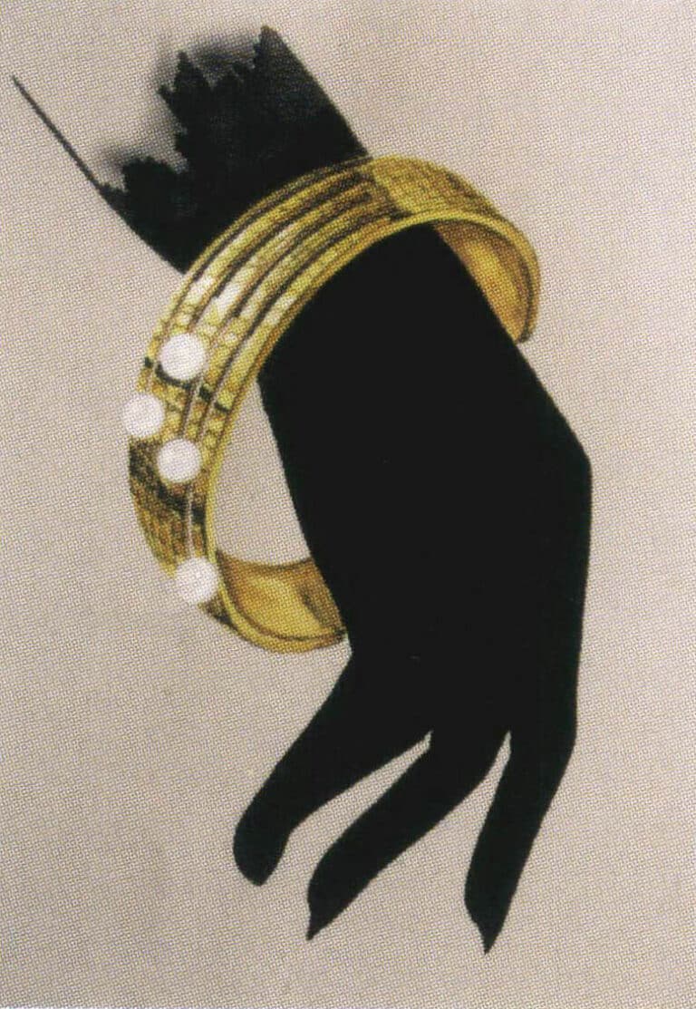
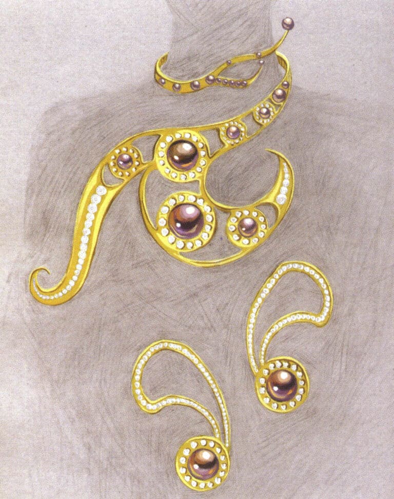
The interweaving of black hand shapes not only indicates the basic position of the jewelry but also complements the brilliant luster of gold.

This artwork uses the hand as a backdrop, making the composition of the painting lively while also highlighting the basic position of the jewelry.
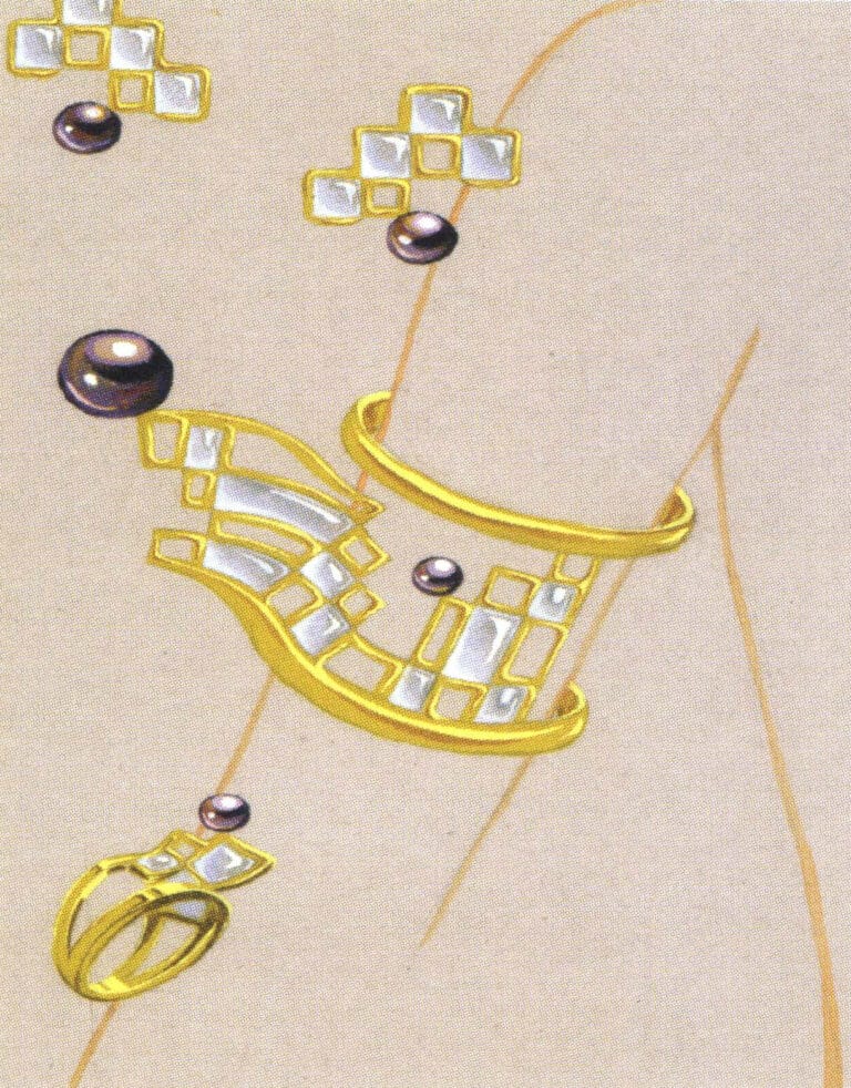
The clever interweaving of the arm's shape makes the composition of the bracelet, earrings, and ring natural and elegant. The textures of gold, ice jade, and pearls are prominent, with bright colors, resulting in a good visual effect.
This artwork involves various materials, clearly focusing on the main elements and a distinct hierarchy.
In jewelry design, sketching is one of the means to quickly express the designer's design intent and seize the structural features, supplemented by a brief relationship between light and dark, which can sometimes play a multiplier effect. Learners of jewelry drawing must master it well.

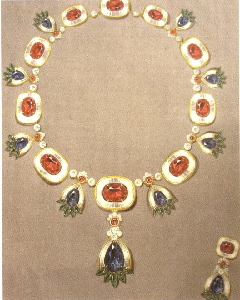
This is a series of designs based on the "Cyanotype " theme, combining platinum and translucent blue colored glass. The picture's background is treated with fresh watercolor, which sets off the theme appropriately.
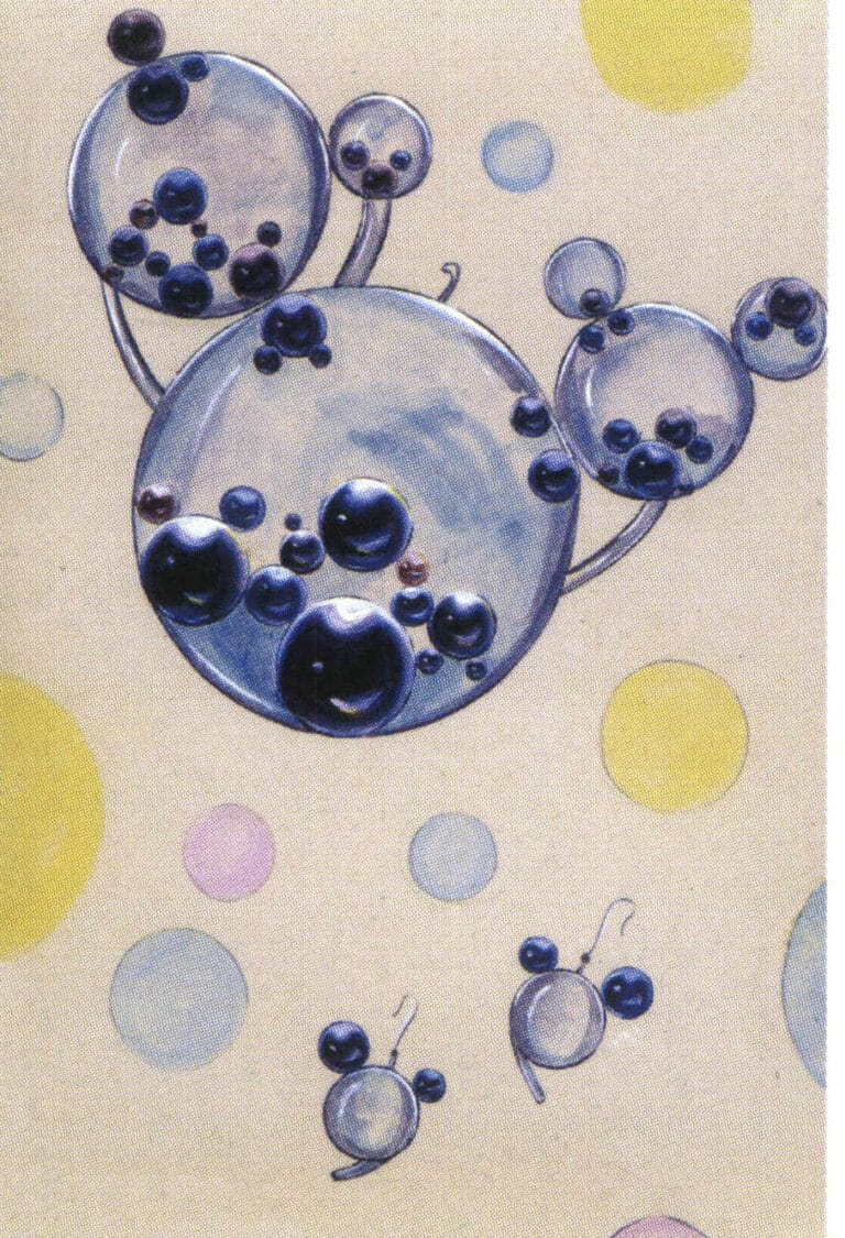
Mickey shape is a timeless classic; the whole picture is lively, relaxed, and fun; the rounded black pearl is lovely in the round glass sphere. The texture of the pearls is well represented in this artwork, and the spherical backdrop of fresh watercolor in the background is interesting. Still, it also makes the composition slightly messy. If the background can be further defocused, it will make the subject more prominent.

The texture of various materials is well expressed, and the picture is holistic and atmospheric.
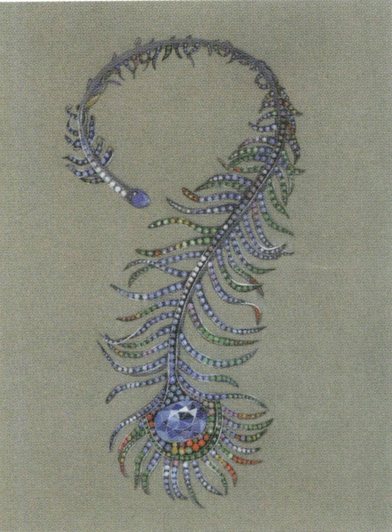
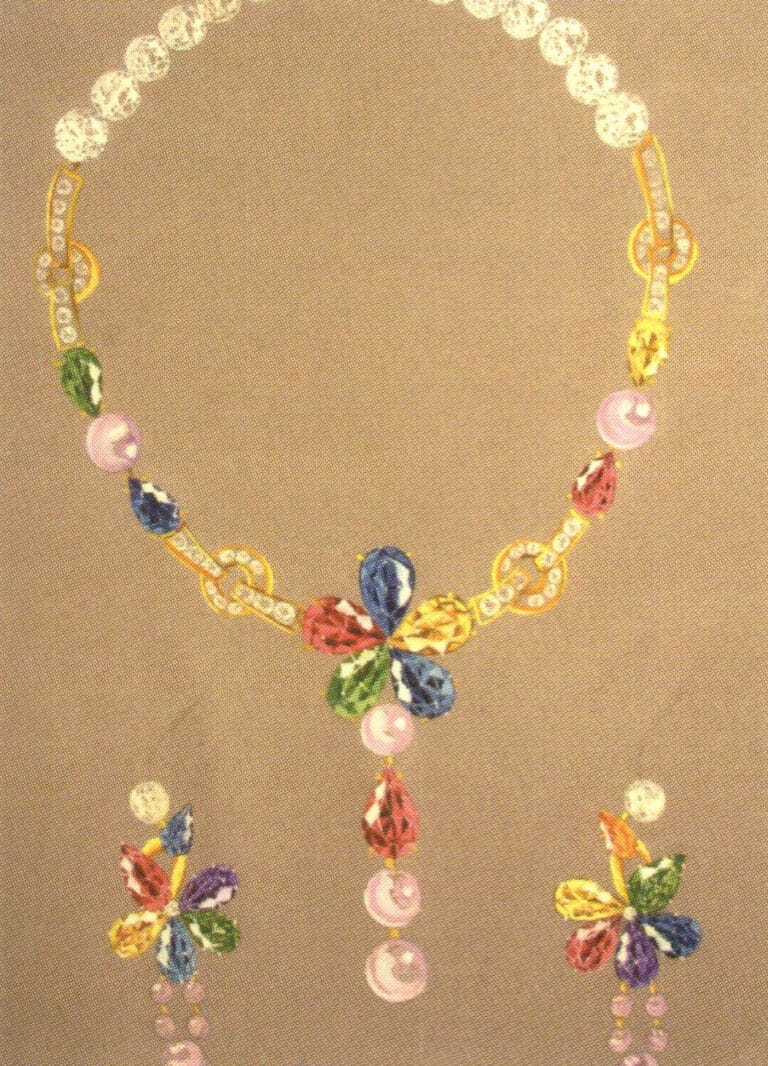
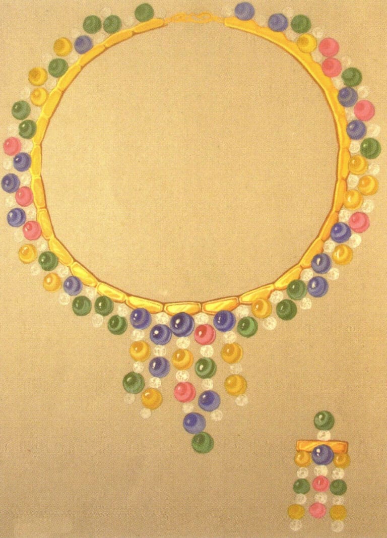
The large number of small colored gemstones on the jewelry increases the difficulty of the painting. In this artwork, the tiny gemstones are rendered using a simplified technique in addition to the careful depiction of the central main gemstone.
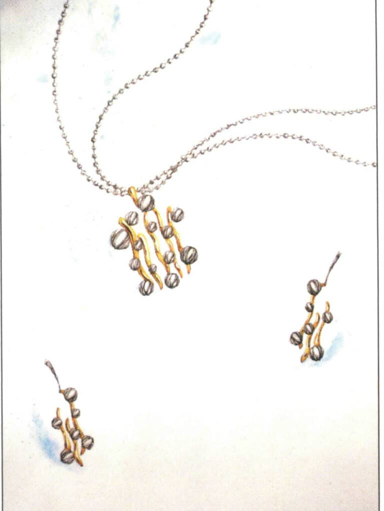
The brilliance of this artwork lies in depicting the platinum bead chain, with each bead chain structure shining brightly. The brushartwork is delicate and natural, and the metallic texture is distinct.
This artwork has a strong sense of wholeness, with the handling of background colors and the division of lines being extremely integrated with the tones and structure of the foreground jewelry. Although there are many types of jewelry, the composition is complete and not loose, making it a fine painting.

It is easy to see from the details of the picture that the author has taken great pains to depict the details of the jewelry, and almost every tiny gemstone structure is shown with great rigor. However, the excessive portrayal makes the picture look flat and lacks focus.
"Seriousness" is the first impression this artwork gives. The jewelry materials in the picture are numerous, each depicted in great detail with a distinct texture. However, the variety of materials results in a complicated range of colors; if it was simplified a bit, the overall effect of the picture would be stronger.
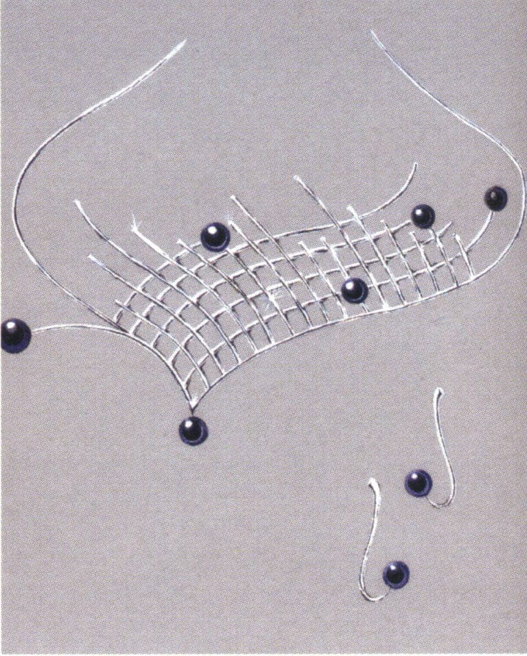
This is a series of designs of earrings and necklaces made of platinum and black pearls with a fresh visual effect. However, the representation of platinum appears somewhat rough, especially when handling dark colors; the lines are not refined enough, and they fail to convey a sense of metallic smoothness and toughness.
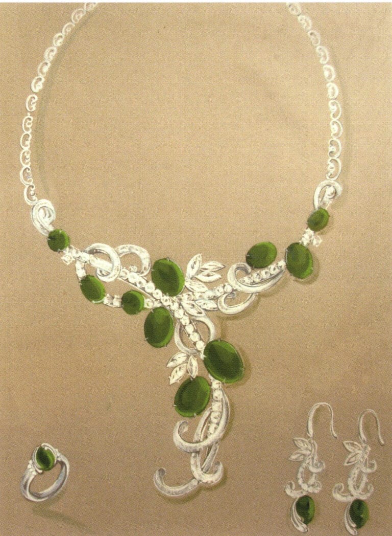
This artwork is depicted with care and attention to detail, with a high level of completion, but the luster of the jade is not well represented and needs improvement.
The high sense of harmony is the highlight of this artwork, where the colors and shapes of the jewelry form an inseparable whole from the background, enhancing the visual appeal of the painting.
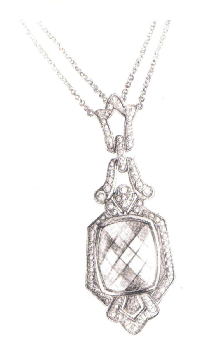
Complexity and simplicity are the strengths of this piece. Each structure of the faceted gemstone is depicted, but the diamonds, using channel setting, are painted cleanly. This artwork is highly realistic and makes a good jewelry painting.
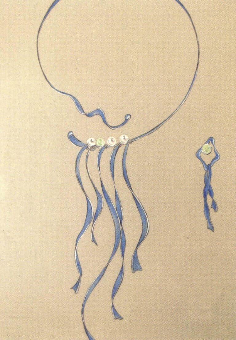
The vague human figures in pencil sketches complement the texture of gold and pearls very well. It is important to note that the pencil drawing should not be overdone; excessive detail in the sketch can sometimes make the image slippery, affecting the paint application.
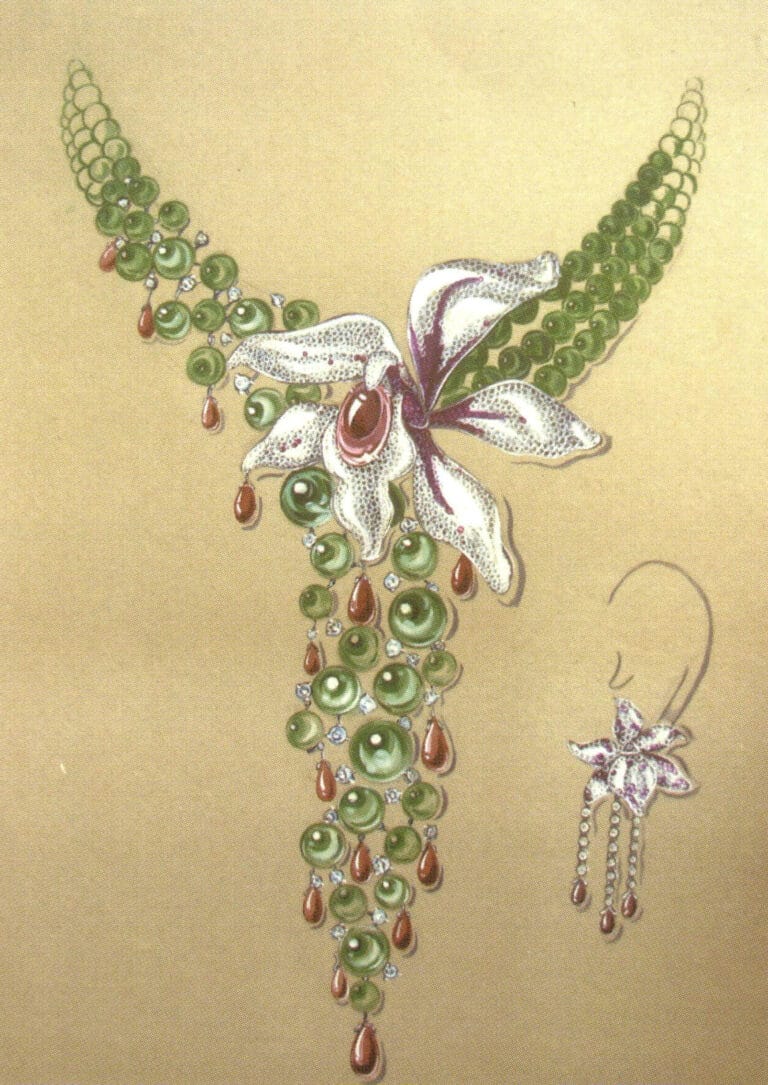
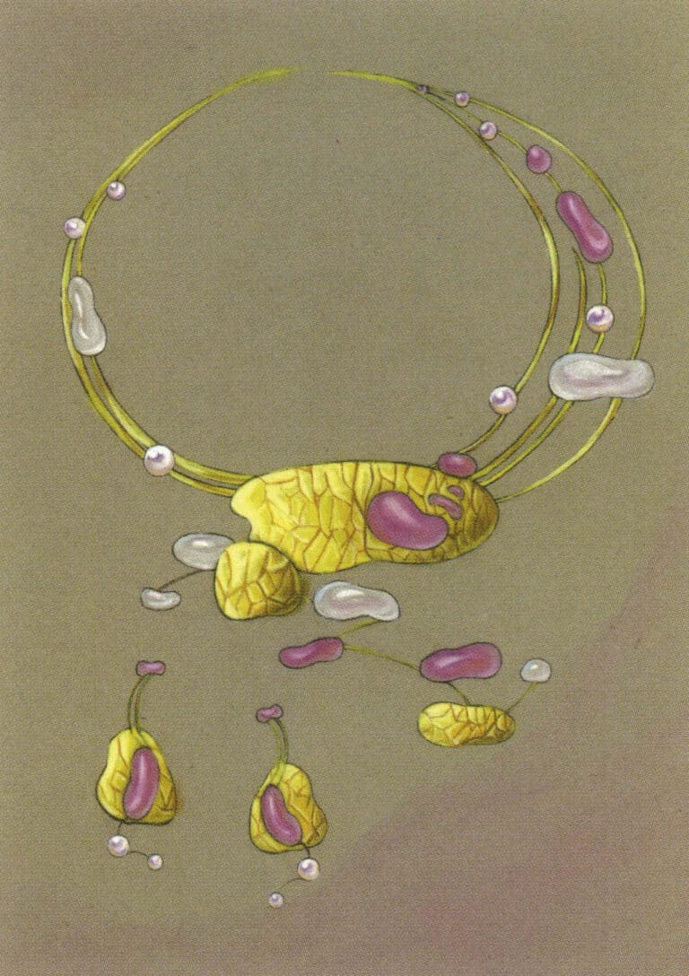
This is a series of design artworks themed "Longing," using a combination of different materials such as pearls, jade, and platinum to express the beautiful love of the Cowherd and the Weaver Girl separated by the Milky Way. The pearls and jade materials are well expressed, but the painting of platinum and the mixing of pigments appear somewhat dry, lacking the luster of the metal.
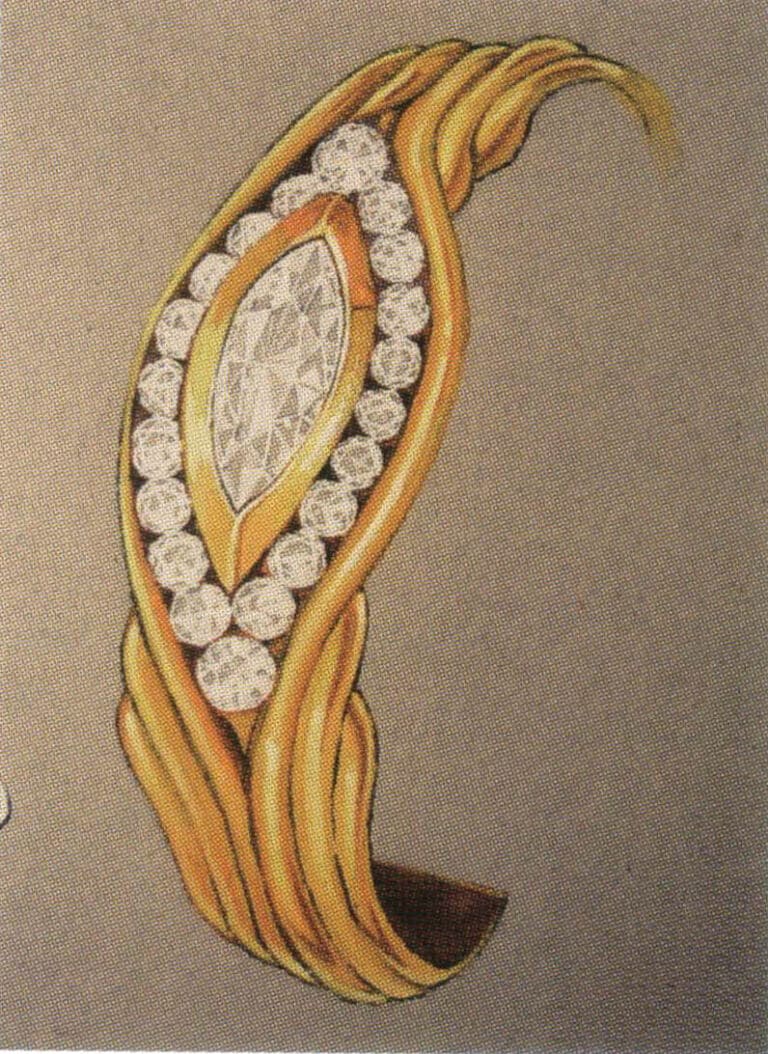
The representation of colored gold, the thickness of the hanging ornaments, and the changes in turns are all clearly explained.
This artwork pays attention to the influence of ambient color on the material's color. Under the reflection of gold, the pearls exhibit a golden sheen, achieving a good degree of fusion between different materials. The darker areas of gold appear dull in color, and the representation of shadows is stiff.

A common problem for beginners in jewelry painting is the inability to handle the relationship between solid and void, especially with the repetitive structure of faceted gemstones. Beginners often fail to distinguish the details and tend to depict each facet individually, which can lead to a lack of focus and clarity in the composition. This artwork handles the relationship between solid and void well, particularly in the representation of diamonds, which does not get bogged down in expressing individual stones but depicts them as a cohesive whole. The painting is stunning.
The difficulty of expressing gold on a white card is relatively high. The structure of this piece of jewelry is very clear, and the texture representation of different materials is also very distinct.
This is a design artwork completed quickly with colored pencils. Suppose you want to depict some smooth surfaces with obvious reflections of metal objects. In that case, you can try water-soluble colored pencils, as their performance is more lustrous than ordinary colored pencils.
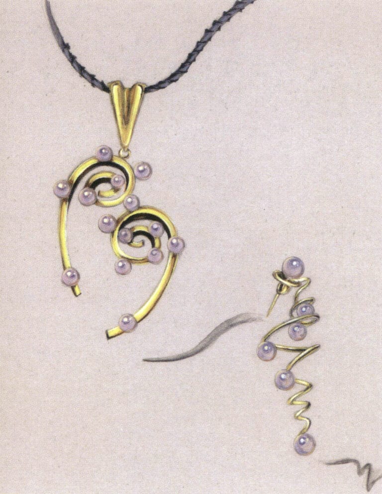
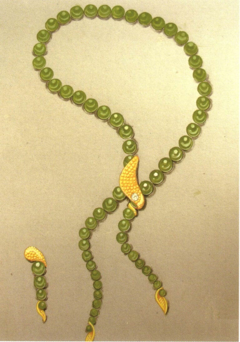
Both are bead-like structures, so the texture difference between jade and pearls is still obvious. The luster of jade is subtle, while the luster of pearls is bright and striking, with a certain degree of reflectiveness.
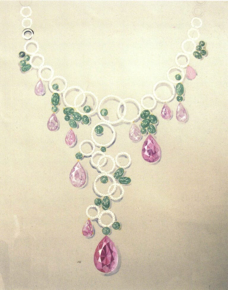
Composition is the primary task in jewelry painting, but beginners often overlook this issue. The focal point of this artwork is lower than the center of the paper, but the details are depicted exquisitely.
The portrayal of this artwork is extremely detailed, with each facet of the gemstone carefully depicted. Still, the excessive caution also makes the brushstrokes appear somewhat stiff—as shown in the painting.
Paying attention to handling the solid and void aspects of the picture is the strength of this artwork. The picture's composition is too full and should appropriately increase the areas of blank space.
The texture of the jade is perfectly represented, appearing smooth and gentle against the backdrop of the golden light. The seemingly casual arrangement technique makes the composition lively and natural.
The jade bead ornaments depicted using the painting methods inspired by pearls appear lustrous and lovely. The relationship between this artwork's main and secondary elements is appropriately expressed, with some beads employing a blurring technique, resulting in a more cohesive visual effect.

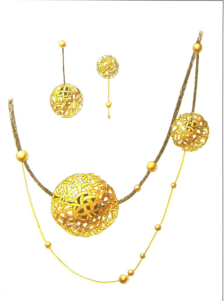
Colored gold is a common material in jewelry design. Although it does not have the dazzling luster of yellow or platinum, the sense of the weight of the metal is evident in this painting.
This is a design artwork completed with colored pencils. Although the golden hue in the picture is not as bright as that achieved by color mixing, it still effectively expresses the object's texture. Colored pencil drawings are an effective and quick way for designers to express their ideas, and students learning jewelry design should pay attention to them.

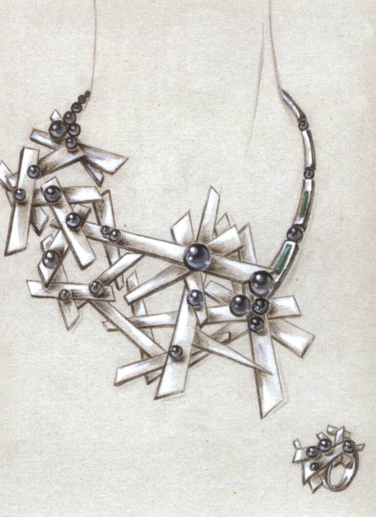
Platinum has always been challenging for beginner jewelry painters, as the "degree" of color brightness contrast is difficult to grasp. This artwork expresses the reflective metallic characteristics of platinum with strong brightness contrast, but overall, the brightness representation of platinum is still lacking.

The fashionable appeal of colored gold gives students a special preference for it. When creating this artwork, the author meticulously depicted the structural changes at every turn, resulting in a neat composition with high visual appeal.
Using charcoal pencils combined with local highlights is a simple technique for expressing platinum. The application of this technique in this artwork is quite proficient, and interested students might try it.

A standard composition with meticulous painting, it is a serious painting.
The round and nearly perfect bead-like structure shows the time and effort the author spent in creating this artwork.

This artwork breaks the common symmetrical structure of jewelry painting by arranging accessories, adding a lively feel to the artwork.

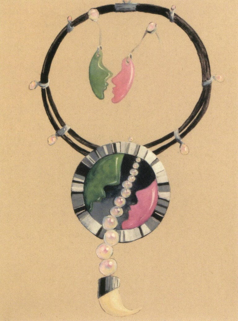
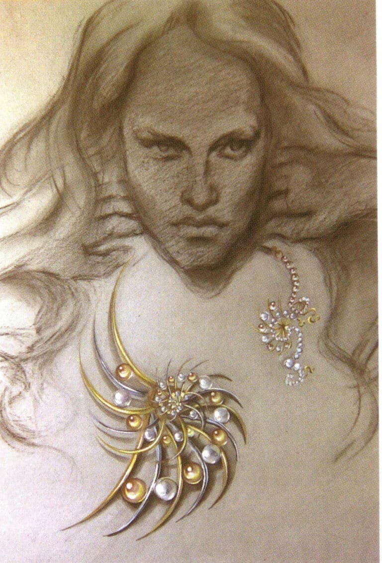
The author is skilled at using contrast to express the texture of materials. The black-and-white realistic portrait recedes behind the bright colors of flowers and gold, with clear layers in the composition and a distinct subject.
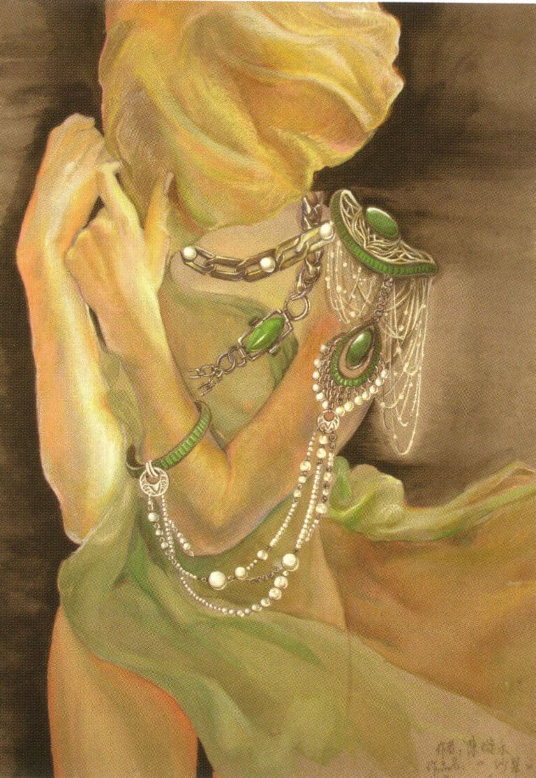
This is a series of design artworks combining pearls and jade. The jewelry is worn on the body, harmoniously blending with the graceful figure of the woman, creating an interesting scene.
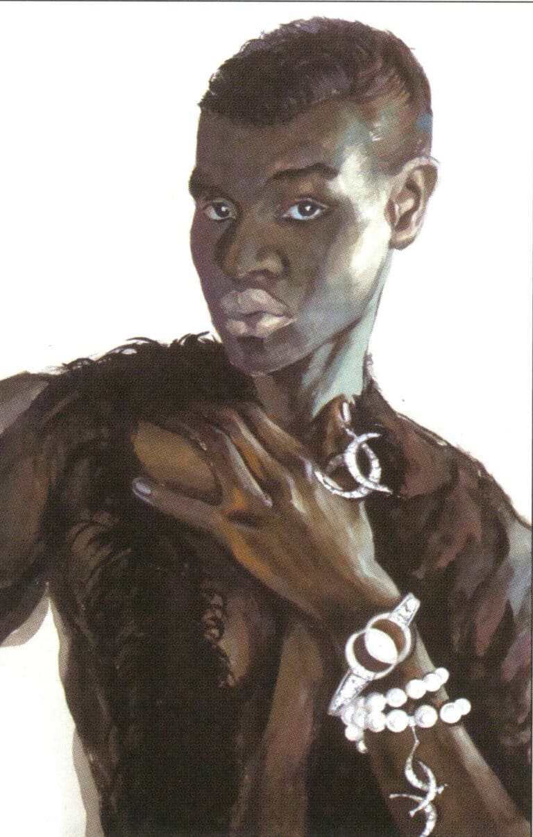
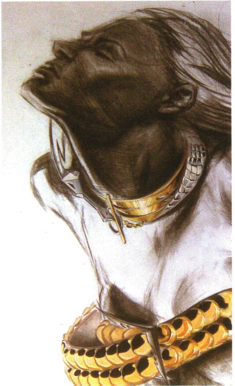
This design artwork combines white pearls and platinum with rich and striking colors. The artwork cleverly uses the skin tone of a Black woman as a backdrop, making the texture of the pearls and platinum stand out even more. The character in the painting has deep and bright eyes that shine with a pearlescent luster.
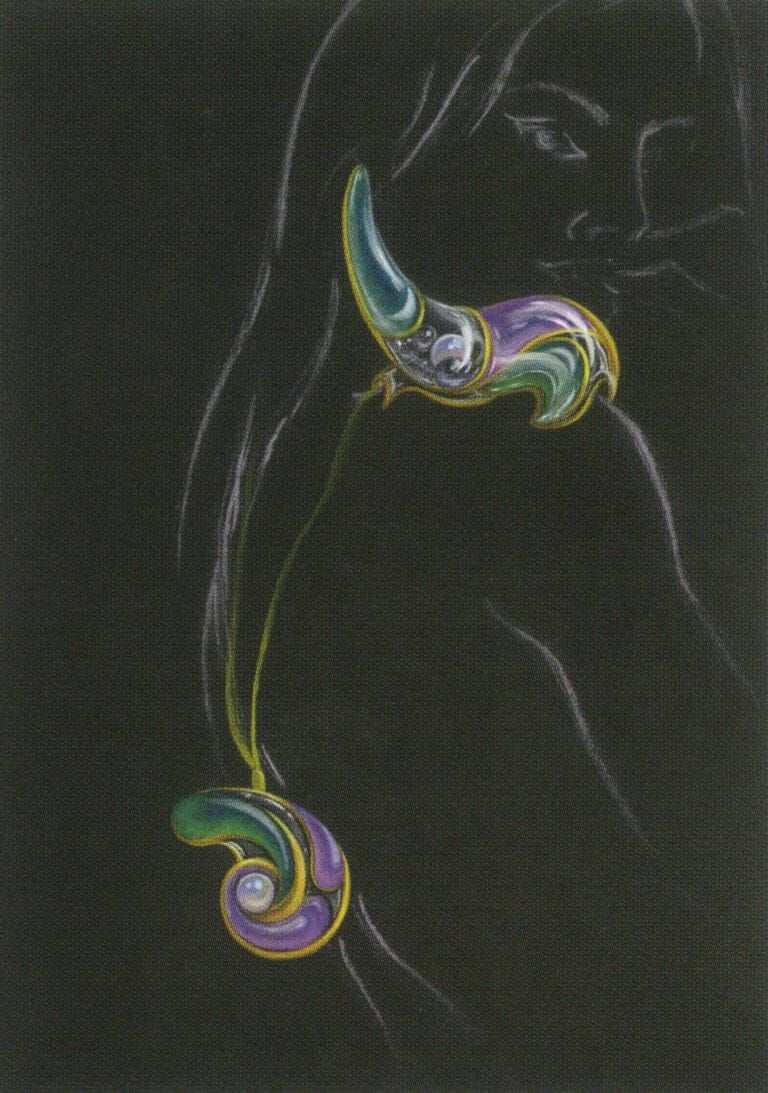
Black cardboard and blurred human forms all make the colors of the gems appear bright.
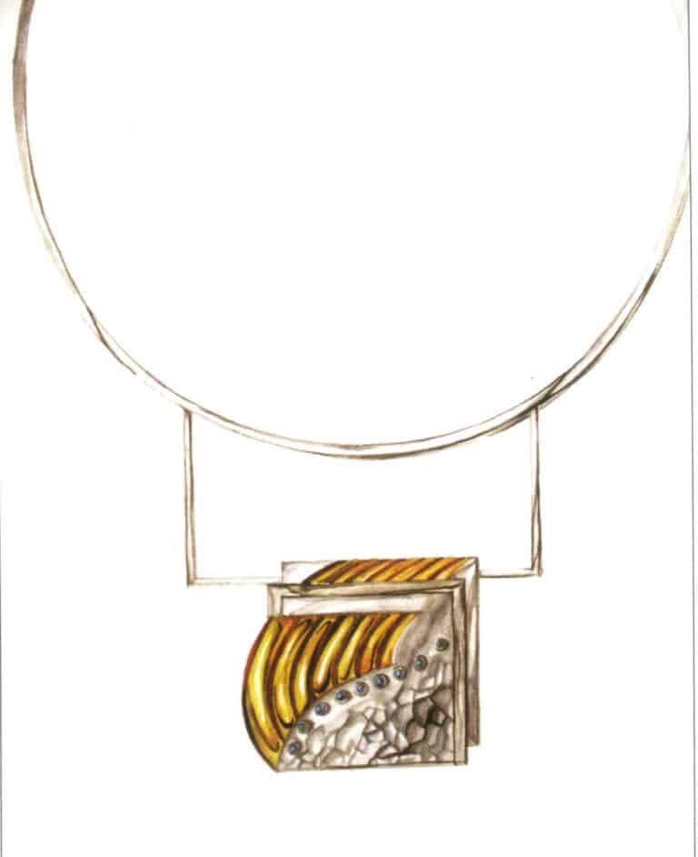
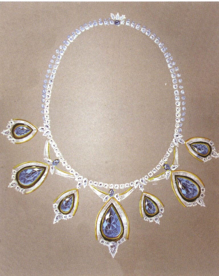
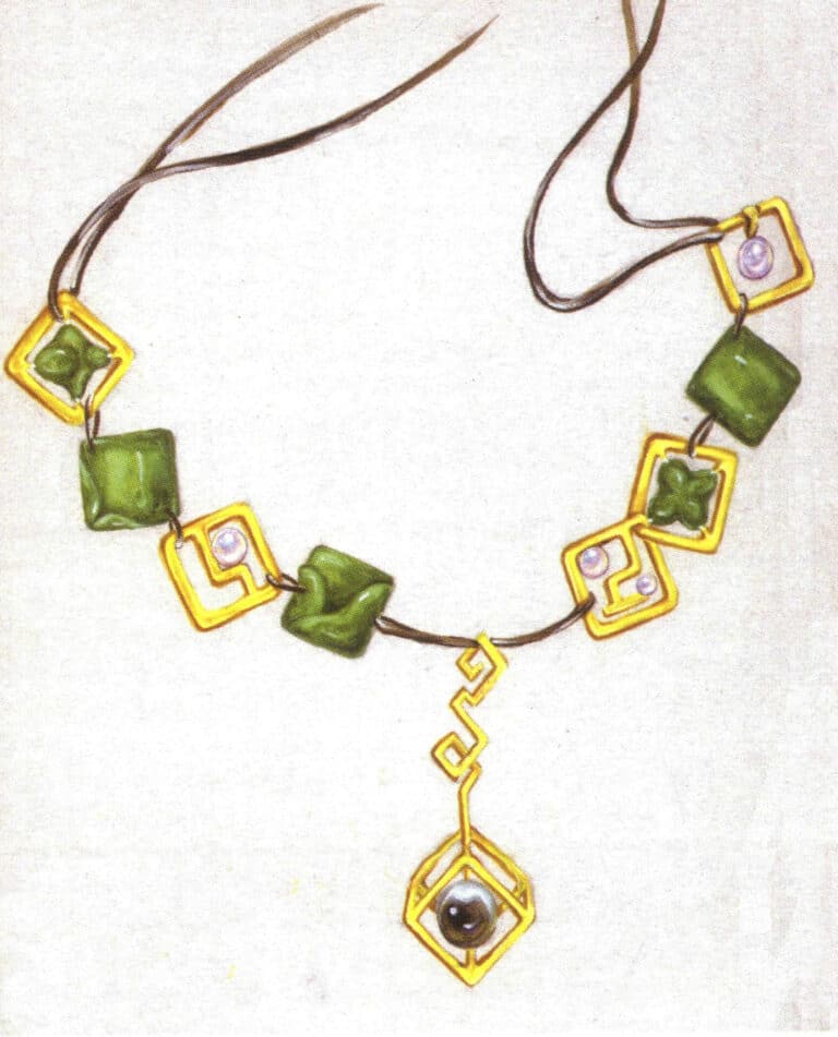
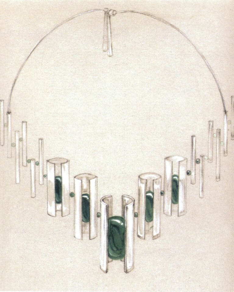
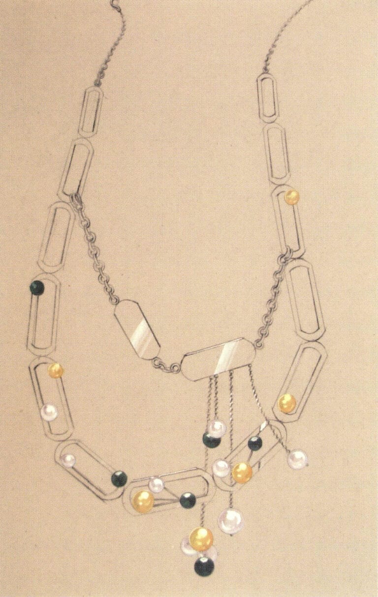
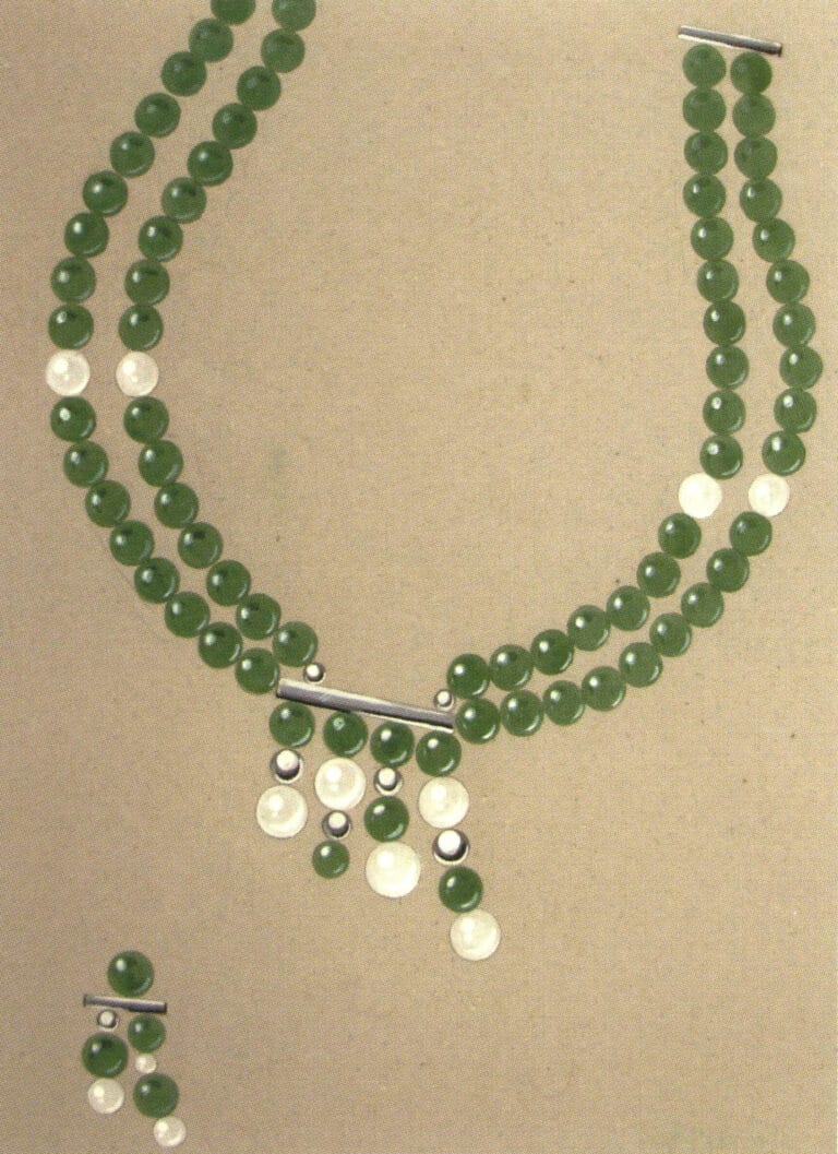
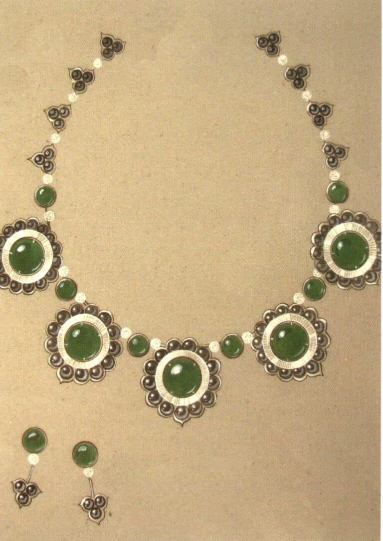
A necklace is a type of jewelry that has a strong ethnic feel. The dangling ornaments of the necklace are often exquisite and unique, which is also the focus that the author needs to carefully depict during painting. Although the depiction of this artwork is sufficiently delicate, the overall composition is too low, which beginners need to pay attention to.
This design combines gold, platinum, and pearls with a delicate and moderate depiction of each material. The connection between the background figures and the jewelry is not strong; if it can be further weakened, the overall effect will be more striking.
Creating an atmosphere in the painting through appropriate background rendering is a technique many students favor. The author slightly enhances the background tones, complementing the colors of the pearls in the artwork, which gives the piece a subtle warmth and makes the jewelry appear more elegant.
The metal appears exceptionally bright against the backdrop of the figures, with the simple depiction of the characters contrasting with the intricate jewelry design, making the main subject of the painting more substantial.
The form of the characters interspersed in the jewelry painting is a double-edged sword; sometimes, it can complement the main subject, while at other times, it can overshadow the main subject and obscure its brilliance. The black-and-white treatment of the characters in this artwork plays a certain supportive role in highlighting the main subject.